Hi fellow Model S-ers.
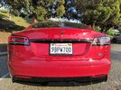
I recently made this raised emblem and I was wondering what you guys think. Should letters be bigger and spaced further apart? Or does it look just fine. I had recently made one for a friend where the PLAID emblem was to the top right which looked fine. I want your guys opinions before I apply the stronger adhesive. What do you guys think?


I recently made this raised emblem and I was wondering what you guys think. Should letters be bigger and spaced further apart? Or does it look just fine. I had recently made one for a friend where the PLAID emblem was to the top right which looked fine. I want your guys opinions before I apply the stronger adhesive. What do you guys think?


 .. Your car looks great btw besides those plaid letters. Cheers