Welcome to Tesla Motors Club
Discuss Tesla's Model S, Model 3, Model X, Model Y, Cybertruck, Roadster and More.
Register

Tesla Winds and Elevation Web Browser App

This site may earn commission on affiliate links.
JSo it appears that they are aware of my email address but over the span of two days I haven't seen any emails from them in either my inbox or my spam folder. What do I do now? I sure hope you can help.

You may need to check multiple places for spam. If you use Outlook, there is a spam folder, and on newer versions, there is also a Clutter folder that it might be in.

In addition to spam folders in your e-mail software, many internet service providers also have their own spam folder that is only accessible by using their web e-mail client. You may have to check there and/or adjust the junk mail settings there.

If all else fails, try a different e-mail address, like for a GMail account.
 
Joe,

Thank you for your prompt reply.

My regular email client is Mozilla Thunderbird but I also have Outlook connected but rarely used. I looked in those two as well as my web email client, ATT/Yahoo, and scrounged in anything that remotely resembled a spam folder. Nothing found. So it looks like my next shot is to try my GMail address and try starting over at Geonames. Wish me luck...

Thank you so much for your suggestions. I'll give the new account a try tomorrow when I'm fresher. Thanks again.

Gene
 
Joe,

Just so I'm clear on the Geonames "username" issue, I understand that while I'm creating a new account I should use a username like any that we are all accustomed to using. Once I have my Geonames API key, or "username," I will then use that one for anything that is appropriate for their account or your app. Is that correct?

Thanks,
Gene
 
@SomeJoe7777 The road grade seems somewhat not useful, or rather unrelatable unit. What might be cool though, is what about representing the grade in kW? i.e. the amount of potential energy gained or lost by the car, per unit time, which becomes kW. If you drive up a large mountain, it might be interesting to see something like "you've gained 10kWh of potential energy".

Also, I transferred the url via calendar and I still had to type in the the API key on the validate screen, I assume it needs a cookie?

@AWDtsla In many mountain regions, downgrade in percentage is posted on road signs, primarily to warn truckers or other heavy vehicles of the conditions. More than about a 3-4% downgrade is pretty severe and can overheat brakes and/or require judicious use of engine braking. Since percentage is kind of the de-facto standard for reporting steep grades, this is what I chose for the display.

As far as using the grade vs time as an energy/power measure, this is much more readily accomplished simply using the power meter in the instrument cluster. As you're going downhill, you'll be able to directly see that you're hovering in the regen area at a certain power level, say 10-20 kW. My app would only be able to update such a number once per minute, which isn't especially useful for energy computations. In addition, the power level from regen varies with speed, even on a constant slope, which could be confusing.

The site does not use cookies. If you had the entire URL within the calendar, it should load without issue on the in-car browser. The full URL needs both the Open Weather Map API key and the Geonames username. The following parameters can be in the URL:

owmAPIK=<Open Weather Map API Key> [Required]
gnUN=<Geonames Username> [Required]
units=<1=Imperial, 2=SI> [Optional, default=1]
lang=<1=English, 2=French, 3=Norwegian, 4=Spanish, 5=German> [Optional, default=1]
mode=<1=Auto, 2=Day, 3=Night> [Optional, default=1]
 
  • Like
Reactions: David99
Excellent app, can't wait to try it out in detail!

For those having issues with setting up Geonames, see if this helps:

After getting the activation email, and logging in with it, logout, and login again.

At the bottom of the home page click on the Download/Webservice link:

upload_2017-4-3_8-29-7.png


Then click on the Web Service Documentation link:

upload_2017-4-3_8-29-37.png


That will finally take you to the link where you can go to the account page to enable free webservices:

upload_2017-4-3_8-31-16.png


I've already done it so all it says is 'free webservices enabled', but it has the link to enable webservices if you have not already done it.

Hope that helps! There may be a straighter path to the account settings page, but I didn't stumble across it!
 
And, it works great in Firefox, but seems not to in Safari iPhone. I didn't see a mention in the thread... any limitations on it? It seems to hang on verifying the keys and then keeps on going with bogus data (negative timers, etc.). Love to use it on my phone or iPad before actually getting a car, lol...


Edit: Guess I could use FF on the phone, never use it for anything else...

The site was designed specifically for the Tesla in-car browser, it was not heavily tested on anything else. The in-car browser uses a very old build of WebKit, and as such there are CSS elements and Javascript that are specific for that browser. Most desktop browsers will understand the older elements and still render correctly, but the phones/tablets may not, as their browsers are fairly stripped down for speed.
 
  • Informative
Reactions: JimK and David99
The site was designed specifically for the Tesla in-car browser, it was not heavily tested on anything else. The in-car browser uses a very old build of WebKit, and as such there are CSS elements and Javascript that are specific for that browser. Most desktop browsers will understand the older elements and still render correctly, but the phones/tablets may not, as their browsers are fairly stripped down for speed.
Gotcha, thanks! I'll see how it works on other things, like my iPad or FF on the phone/tablet.
 
This app does work great. My wife, who is a master at breaking s/w, saw me using it on a trip to Canada and immediately understood the information. She pulled it up on a recent trip to Los Angeles, realized she had 30mph headwinds and would need to make a short charging stop.
 
  • Like
Reactions: e-FTW
Would you consider making this open source? I would love to contribute to this. Just got my S85 a couple months ago... I'm a programmer and love the car.

Hi AmpdUp,

I haven't declared the project open source, but all of the code is visible to everyone. Virtually nothing runs on the server, all of the programming and processing is done in JavaScript on the client. If you load the site on a desktop browser, you'll see all of the HTML and JS code.

I'm open to any suggestions or additions if you want to develop them, but I cannot guarantee that I'll roll those into the project.
 
  • Like
Reactions: David99
SomeJoe7777, I want to complement you on the very nice UI. It is simple, high contrast and very readable. Tesla needs to hire you to redesign the crappy UI that is extremely difficult to read. Anyone that designs a light background with tiny grey letters in an automobile should be shot.

Thank you for creating this.
 
  • Like
Reactions: AWDtsla
SomeJoe7777, I want to complement you on the very nice UI. It is simple, high contrast and very readable. Tesla needs to hire you to redesign the crappy UI that is extremely difficult to read. Anyone that designs a light background with tiny grey letters in an automobile should be shot.

Thank you for creating this.

Thanks, Michael!

Human-machine interface is something that I've thought for a very long time has been quite poor. Not just in computers/software, but in other areas as well, such as industrial and factory/plant. I have a good deal of experience from long ago with industrial/plant operators' panels where many indications (e.g. temperature, pressure, flow, valve positions, circuit breaker positions, pump status, etc.) are shown and I've always thought that those were some of the poorest excuses for a human-machine interface I'd ever seen.
  • No logical organization. Frequently, there are parameters in the plant that are related to each other but their indicators are on opposite sides of the panel.
  • Every indicator looks the same.
  • Indicators are hard to read.
  • No difference in an indicator for temperature (reading in degree F / C) and an indicator for pressure (reading in psi or bar) -- same numbers, same font, same color.
  • No way to spot trends -- parameters can change slowly and you can't see that movement.
  • Inconsistent use of color -- one panel has open valves in blue, a different panel uses green, another uses white. One panel uses "lights off" to indicate closed valves, another uses red.
  • Panels with rows of dials and numbers actively discourage the operator from properly visualizing and understanding the equipment status. The display should be far more visual and intuitive.
  • If those aren't bad enough, the real downfall of these poor human-machine interfaces is in an abnormal/casualty/problem situation. The panels do not assist the operator in focusing on what's important. In a plant/industrial accident situation, it's not unusual for dozens of alarms and warning indicators to be actuated. Only a few of them are really important and directly relate to the actual problem, all the others are a symptom or side effect of the main issue. Yet the panel doesn't assist the operator in prioritizing what is critical and what is not.

For this website, I wanted the central indicator to be an all-in-one, intuitive summary of the wind situation as it relates to the car. At one glance, the driver is supposed to be able to immediately infer exactly how the wind is pushing on his car without looking at a single number. The rotating compass, car image, and wind pointer directly convey this. Other indications break down that situation into more detail, such as the vector wind components (in a separate panel to the left, non-centralized because it's secondary information), and ground speed/air speed (in a separate panel below for the same reason).

I also wanted judicious and consistent use of color -- wind things are always in the light blue. Extra energy use is always in orange (matches the Tesla power meter), and energy recuperation is always in green (also matches the Tesla power meter). The one dot of red in the display is the North indicator on the compass. Red is a color that has to be very discreetly applied and only when absolutely necessary. It's the alarm/danger color, and shouldn't be used for anything else except very judiciously.

Because we're driving, easy readability at a glance is highly important, which is why I chose the high-contrast display, large font for numerical information, sans-serif font for on-screen readability, and careful selection of font size to convey the importance of each piece of information. Buttons are always in the shaded blue to match the Tesla interface. Web site interaction is designed for touch screen, with larger buttons so that you can hit them quickly while driving. I also wanted all information on one screen with no "modal" areas that have to be switched back and forth to get all information.

One of the trends in UI design that I think is a good thing is getting rid of the skeuomorphism (a type of UI design where the UI directly emulates or is reminiscent of a real-world object), like Apple's interfaces during the Steve Jobs era. IMO, skeuomorphism complicates the design and gets in the way of the UI doing its job. The UI should do one thing above all else: Get the relevant information to the user in the simplest, easiest, and most intuitive way possible.
 
Thanks Joe very helpful post, didn't realize I had to enable the account!


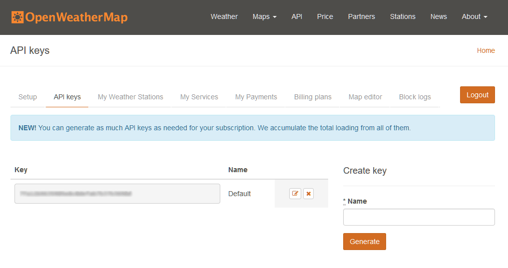
Make sure you are using the actual API keys, not your account username or password. For OpenWeatherMap.org, you create a new account. After that, log in with your newly-created account, go to the API Keys tab to see your API key:


TWE-OWM.png


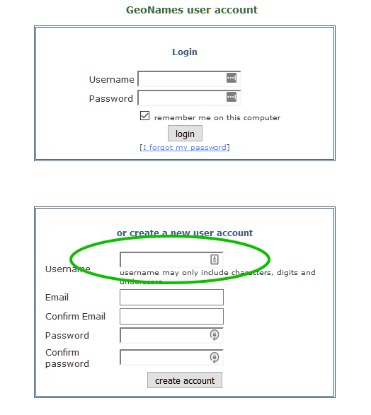
For Geonames.org, they call the API key your "username". There are two steps. First, create an account along with a username:

TWE-GN1.png


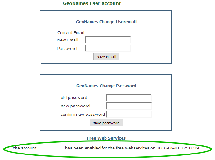
Now, once the account is created, you go to the manage your account page, and you need to click on the link at the bottom to enable your account for the free web services:

TWE-GN2.png


In the Tesla Winds app, you will type in the OpenWeatherMap.org API key, and the Geonames username.