I agree their
design philosophy has been forcing their hand in this...
Returning to the idea that this is based on a more forward dash in the Model 3, I don't see it in the pictures.
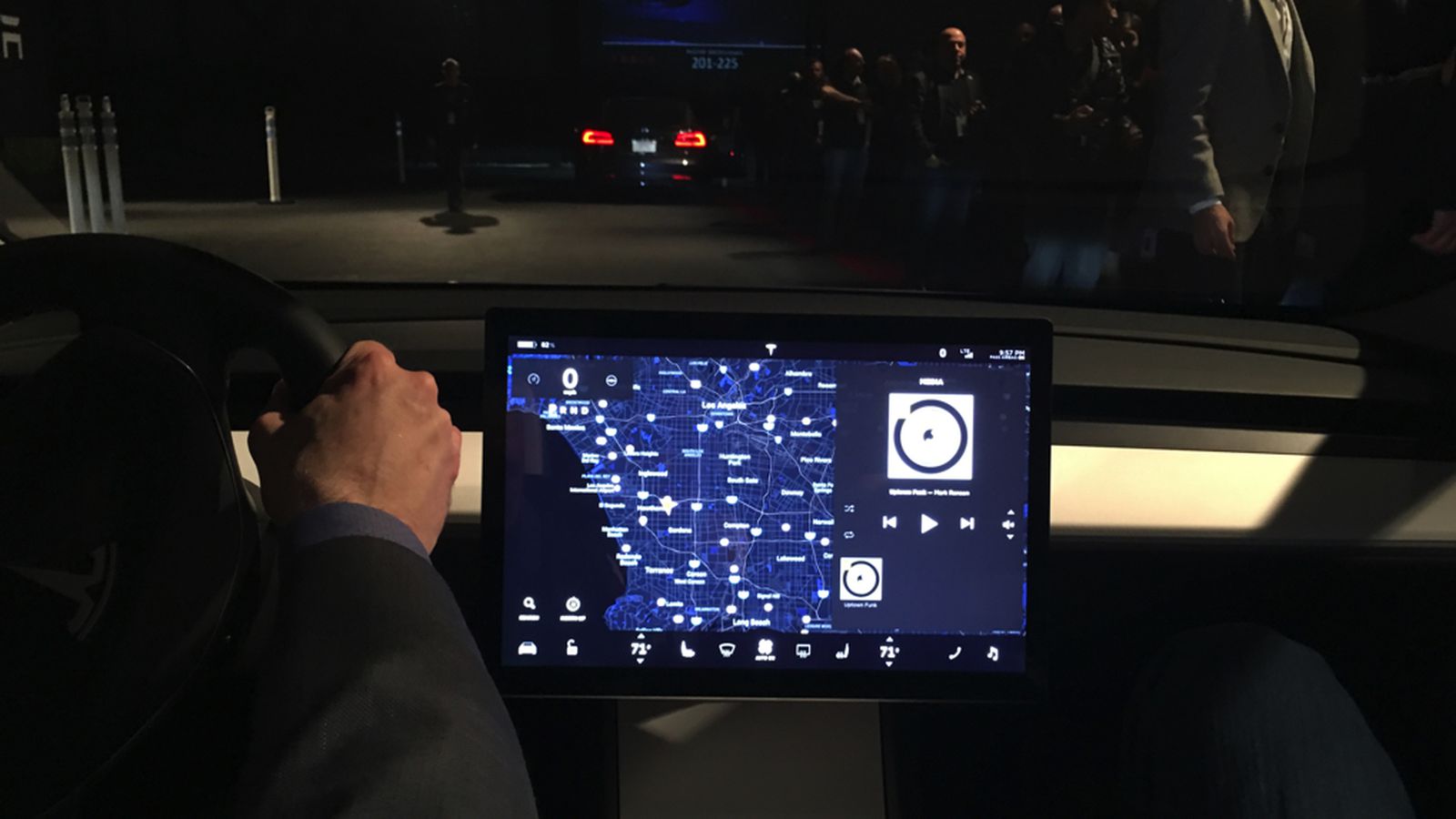
Also, wouldn't that mean the steering wheel would still have to further along from the dash to create that distance between the driver's eyes and the screen? In other central speedometers we have seen, the screen for the speedo has been deliverately pushed far back over the top of the dash (like on the Prius)... instead on the Model 3, release candidate video included, the screen seems to be there right alongside the driver's hands - after all, it also has to work as a touchscreen...
I am not seeing how a screen so close to the driver and to their right can be ergonomical while looking out the windshield. Even on Model S the instrument cluster screen is further away from you than the big screen. That it is covered also helps with glare. Interesting to see if the Model 3 screen might suffer from glare issues as well as viewing ergonomics.