Welcome to Tesla Motors Club
Discuss Tesla's Model S, Model 3, Model X, Model Y, Cybertruck, Roadster and More.
Register

Everything wrong with V11 update / user interface.

This site may earn commission on affiliate links.
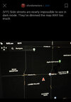
Is the attachment you posted showing that the side streets are missing or one that showing that they are there? I can clearly see all the side streets on that attachment. Actually it is much better than what I could see in the new UI dark mode. It was definitely not the best choice of shading for the side streets, but I could still see them just not as defined as before.
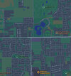
That imagine was from an iPhone and the streets are there. A previous post of the same area shows some streets but the side streets are nearly invisible.

Here I added both. The black one is from the internet. Tesla map at nighttime. The green/blue one is the area from the maps app on the iPhone. The Tesla view is clear of clutter.. and roads
 

Attachments

  • B95EB2AA-6233-4B6C-AF64-47F3B13234A5.jpeg
    B95EB2AA-6233-4B6C-AF64-47F3B13234A5.jpeg
    728.7 KB · Views: 83
  • 4475C94C-D367-4C19-90F9-DA4CFAE1AE76.jpeg
    4475C94C-D367-4C19-90F9-DA4CFAE1AE76.jpeg
    839 KB · Views: 62
That imagine was from an iPhone and the streets are there. A previous post of the same area shows some streets but the side streets are nearly invisible.

Here I added both. The black one is from the internet. Tesla map at nighttime. The green/blue one is the area from the maps app on the iPhone. The Tesla view is clear of clutter.. and roads
Well I just went out to my car, lights out, map in dark mode and brightness to 25% and I could see them without any problem. I don't know what to tell you.
 
That imagine was from an iPhone and the streets are there. A previous post of the same area shows some streets but the side streets are nearly invisible.
Yes, I looked at the previous image posted and it was hard to see. But I went out to my 2 cars and tried it and the maps do not look like that. I am wondering if it has something to do with the display. Maybe not all cars were set to the same contrast ratio. Even though brightness is adjustable, contrast is not. With the shade of grey so close, you will need a high or maybe low contrast setting to see them clearly. I don't remember it was high or low contrast you need to see the difference between close shade of color.
 
Last edited:
That imagine was from an iPhone and the streets are there. A previous post of the same area shows some streets but the side streets are nearly invisible.

Here I added both. The black one is from the internet. Tesla map at nighttime. The green/blue one is the area from the maps app on the iPhone. The Tesla view is clear of clutter.. and roads
Are these images from YOUR car or did you grab them from the internet? It looks like the screen is malfunctioning to me. Even on 0% brightness (although I know it is contrast really but brightness will help a little) I can see MUCH better than the image you posted. If that was me I would get the screen checked out.
 
Are these images from YOUR car or did you grab them from the internet? It looks like the screen is malfunctioning to me. Even on 0% brightness (although I know it is contrast really but brightness will help a little) I can see MUCH better than the image you posted. If that was me I would get the screen checked out.
One other thing I would check is the age of the display. Is it MCU 1 or MCU 2 display. My M3 came with MCU 2. My MX was MCU 1, but upgraded to MCU 2 last year. After they changed out the MCU and the display, I can clearly see the display improved a LOT. Everything was clearer and sharper.
 
  • Like
Reactions: TexasTezla
One other thing I would check is the age of the display. Is it MCU 1 or MCU 2 display. My M3 came with MCU 2. My MX was MCU 1, but upgraded to MCU 2 last year. After they changed out the MCU and the display, I can clearly see the display improved a LOT. Everything was clearer and sharper.
I guess we need to know if it is HIS car this image was taken from or just an internet photo....
 
The points of interest icon does bring back the superchargers for me. After the V11 updates for both my MX and M3, they turned off the points of interest on the maps. Once I turn them back on, the chargers came back along with all the other icons. I like the clutters actually. Otherwise the map just shows LA's traffic which is really sad and red... LOL.
Interesting! I'll try that again! I was selecting the search input and toggling superchargers
 
I haven't been here much for most of this year, but I'm making a special return appearance to tell you everything I don't like about V11. I'm sure I'll forget some things, so it'll probably take a few posts. I've said it before and I'll say it again, Tesla should be paying me as a consultant on their UI's before they release the updates. I'll tell them what they are doing wrong.

I downloaded V11 this morning (Merry Christmas!) and took one short drive and I already see numerous problems.

The TL;DR version - everything is either ok or needs to be put back how it was. I didn't see one single thing that I thought was an improvement.

One thing we've never had that we need is the ability to set the default headlight setting to OFF. For 3-1/2 years I've been getting in my 3, entering PIN to drive, opening Controls, and turning the lights off manually. I'm a big boy, I can decide for myself when the headlights need to be on.

The mileage / power and trip meters were removed from the bottom left and put in the Controls screen. Why? And then they removed the tenths digit from the trip meters! Now how am I supposed to know when I've driven a mile AND A HALF? Nice double fail, Tesla! Can't even swipe sideways in the bottom left of the screen to bring them up like they've been since I bought my car in May 2018!

Heater controls are different. Not really good or bad, but they didn't need improved.

That "customize" X at the center of the bottom edge -- there is NOT ONE THING in the available icons that I ever use. So it is useless to me. I play no games in the car, or caraoke, or web surf while driving. And I'm alone in my car 99.9% of the time, so no need to entertain passengers. Put the battery icon there, not just the energy graph which I almost never use. Put the trip mileage meters there.

The battery / charge icon opens into the Controls screen to show the battery now, instead of the old dedicated battery screen. That was a change we didn't need.

Turning the streaming channels off, like AP news or Comedy stations or whatever - I used to just tap the Phone icon next to the Streaming icon. Can't do that anymore.

I'll think of more the next time I drive somewhere later today. So far I see V11 as one big bad idea.

We should have the option to select which version of the UI we want. I jumped from 10.2 to 11.fail . There's more than enough memory in computers these days to store the different versions.
Agree completely. May I add that the seat heater icons need to go back to where they were before (on bottom toolbar). Now in v11 you have to turn on the air-conditioning system in order to heat your seats! Now that really sense!
 
  • Like
Reactions: Sporty and Need
Agree completely. May I add that the seat heater icons need to go back to where they were before (on bottom toolbar). Now in v11 you have to turn on the air-conditioning system in order to heat your seats! Now that really sense!
Yes! I know you could use voice command, but I don't like to talk to my cars. The only machine I talked to is Alexa. Sorry "Hey Google" and "Siri".
 
Here is my take...I agree with many this in many critical ways is a step backwards:

1) Controls should be customizable on the bottom, just like Apps are. You should be able to place front/rear defrost, heated seat control, etc, on the bottom row. Removing them to a secondary menu when there is ample space available is no good.
2) Removal of the "cards" is another step backwards. If anything card functionality should have been expanded. Trip statistics and tire pressure now is hidden in a secondary menu. If you want to view this you lose access to the map. Big fail in my opinion. Cards need to be brought back or at least the Trip information needs to be placed on the left side and visible while driving. This affects anyone taking a longer trip who likes to monitor their efficiency, see how far they have traveled, etc. Big loss of functionality and I am really upset at this.
3) Smaller fonts and icons....does Tesla not listen? Many people have been asking for LARGER fonts for years. At least the option to change font sizes. I don't like the smaller autopilot icon - too small. The GUI should be font-sensitive. Looks like it is not. Bad coding. They would need to re-write the entire GUI to support this most likely, which is probably why they haven't done it.
4) Placement of the blind spot camera is not optimal and sort of looks like a hack. I have found myself looking DOWN at that image and not in my mirrors or over my shoulder as I should. Still thinking about this one but I think placing it at the TOP of the screen would have been better. It would be closer to being in-line with your sight. Also it is not fast enough sometimes to display. It's like a 1/2 second or 1/4 of a second too slow to come up. It seems to be a tiny bit variable. Anyway a light in the mirror is still better. Most cars have this now and Tesla should bite the bullet and put a blind spot indicator light in the mirror.
5) Fan adjustment is just a slider. There should be + and - icons on either side of the slider. I find myself jabbing at the circle to try to raise or lower the fan while driving, especially if you have to reach a bit (eg. your arms aren't super long or your seating position is further back). + and - icons would be easier to press. And more accurate.
6) They took away the minutes/seconds display of a song (in streaming anyway). First thing my autistic son mentioned to me. He also said everything looks smaller. Also I don't really like the switch to two-row and thus smaller album art. Yes I know you can swipe up to get bigger art. Still. I liked it better before with the larger album art icons all the time.
7) Many of the screens don't have an X to close it. You have to swipe down or press the car button for them to go away. But it's not consistent. Anyway there is space for the X so why take it away?
8) Current driver profile is now missing from the top of the screen. I liked to know what profile I'm in and be quickly able to change it. The car does not always get it right so I have to manually switch it sometimes, especially when leaving my house - if my wife's phone is still within bluetooth range it will think it is her even when I sit down in the car to drive away with my phone.

I am sure there are other things I will find, but overall I am not happy about this update. I get a feeling Tesla doesn't listen to customers or actually think about functionality needed while driving, especially for those in colder climates where quick access to heated seat control, defrost control, and efficiency information are very important.
The X close screen is maddening. I'm sliding my finger up and down trying to get to what I want. This is not safe for driving.
 
I agree with most sentiments here (esp the removal of the quick controls for wipers, defrost and seat heating)... but I do like the blind spot camera when signaling.
That blind spot feature should’ve been already in the system from day 1. I hate the new update. I bought a car to drive. Not a video game. I wonder how many accidents will happen before they reverse this update.
 
Hey asshat, take a look at the others saying the exact same thing as me. Just because you whine about the release doesn't mean we all have to. NO streets are missing on my map...got it pal?!

Can't have a conversation without name calling people that disagree. Amazing. Best feature of this site is the ignore list.
 
Can't have a conversation without name calling people that disagree. Amazing. Best feature of this site is the ignore list.
We're getting closed to beating a dead horse time with V11 comments. I just quickly scanned some TMC user profiles and there is one user with more than 50 posts complaining about V11. There's another bunch with almost as many. Most of these posts add either no new information or suggestions for improvement. This forum is for discussion and
last I checked it is not an approved option for either contacting Tesla or for psychotherapy.
 
I guess you haven't figured out that all you need to do is press the map screen and hit supercharger icon and there they are...! I love the fact the screen is only cluttered when I want it to be!
That isn't there in the V11 update. I agree that was simple but pressing the map doesn't bring up the supercharger icon. You have to click on the Navigate box and then you can choose Supercharger.
 
  • Disagree
Reactions: TexasTezla