bollar
Disgruntled Member
That's for timing the 0-60/100 off the lights
I'm waiting for someone to compare it to the Naval Observatory before I'll use it.
You can install our site as a web app on your iOS device by utilizing the Add to Home Screen feature in Safari. Please see this thread for more details on this.
Note: This feature may not be available in some browsers.
That's for timing the 0-60/100 off the lights
Keep in mind if you've had the update staged (yellow clock icon) already, the car isn't downloading additional updates until after you install the one that is staged (likely 2.7.56 or whatever). So if Tesla pushed 2.7.77 to you and you haven't installed 2.7.56 yet, it could just skip you in the meantime.
Also what wk57 just said. If you didn't install V7 before, how do you know you received another update? It's just prompting you once a day to install the already-downloaded update (2.7.56) before it will download any subsequent updates.

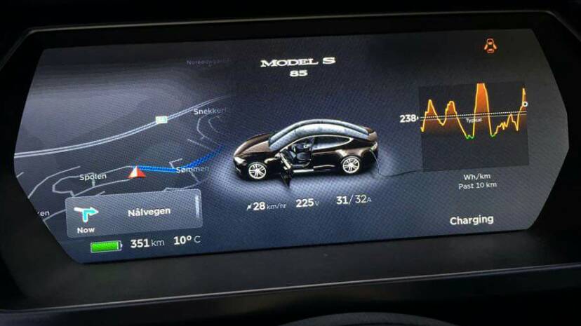
Energy app lost the lines
What is missing in the new energy app?
Yup it is. Sorry for the delayed answer, my post was under moderation. I also added some screenshots in that post with (as it seems) US cars having the update. (or at least CNET has it, maybe a demo car though)It has to be Classic Model S since no AP cars go the old-style speedo/energy dial.
It only does when the box is taller-- when it shows the lanes under the directions.But the turn by turn doesn't appear to block the battery/range readout.
The X and y axes. The lines don't have any scale now.What is missing in the new energy app?
I have noticed a couple of significant bugs:
- if my wife uses the car with be iPhone and then I use the car with my iPhone, the list of "recent calls" includes a combination of her calls and my calls
It does not happen in my car after hundreds of miles and many turns using nav in V7.
Are you kidding ? If that was essential we would have gotten it years ago. Boring stuff. ...Anyone know if 7.0 introduce multi point map destinations?
Anyone know if 7.0 introduce multi point map destinations?
Well there you go! World order is restored[emoji4]. Maybe Tesla does listen to feedback after all.
Will be restored once they swap the range indicator and odo/car icon. Makes no sense they way they have it now.
It does. Odo in the speedo is the classic ice display. Tesla is trying to de-emphasize range anxiety and make car more familiar to the masses. Reduce intimidation. Not saying I agree with it, but I'm guessing that's why they'll not likely swap this back. As for me, I'd prefer original setup but if this helps them sell more cars and stay successful, it's a small price to pay. PS after 10 days with 7.0 I'm liking the look more and more. Minimalist. Need to fix daytime shading, but that's it. Except 3rd party apps and new media player!
I don't disagree with you. I don't like the move either. But I would not let it destroy my enjoyment of the car!I highly doubt having the battery icon relegated to the bottom of the screen where it is stupidly annoying and distracting to read while driving is going to help sell more cars. Of all the changes to 7.0, this is the one I absolutely can't stand. I mistakenly updated to 7.0 a week ago and have acclimated to most of the changes, but this one chafes me every single time I get in the car. And I've written to Tesla to complain about it. Oh, and I really dislike the toy car too. Lot of good that does me while I'm driving (not).
I was thinking about this yesterday. It is anoying because it takes an extra eye movement to check speed and range . In 6.2 you do it with one glance.Will be restored once they swap the range indicator and odo/car icon. Makes no sense they way they have it now.


