Welcome to Tesla Motors Club
Discuss Tesla's Model S, Model 3, Model X, Model Y, Cybertruck, Roadster and More.
Register

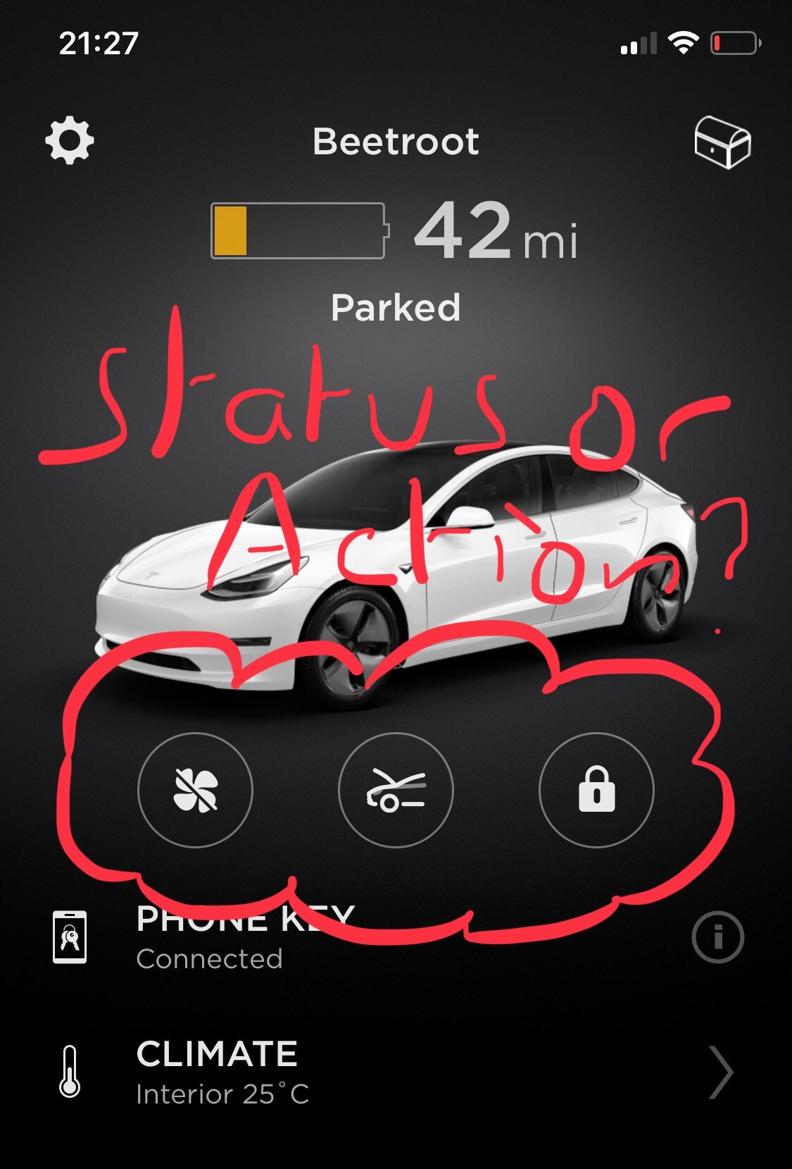
the app icons status or action...

This site may earn commission on affiliate links.
so i have had the model 3 for 18months, and my father a model s for almost 3 years.

nearly every day i’m bugged by the app. the boot open button appears to be an action button to open the boot as it shows the result of a press and not the status of the boot. next to it is the lock icon where padlock shows closed when the car is locked so its a status icon in that pressing the closed padlock opens the car. surely would have made sense for both to be status or both to be action. the fan icon is similar to the boot. it shows status off when the fan is off.

pick a designation and be consistent then i wouldnt be unlocking it when i think that it might already be unlocked and needing locking.

rant over. love both cars otherwise (mostly)
2F4D2171-33E3-41D2-A979-3D644FED59F0.jpeg
 
Well, it's good to be passionate about things. Isn't that a bonnet/frunk control and not 'boot'?

What would the pictogram be if it was showing you the status? Just the front of the car? how would you then know what it does?
 
  • Like
Reactions: Durzel
It is somewhat incongruous that two of the three icons are toggles, and the middle one is an "action" with no feedback.

On the other hand if you had to wade through several screens to open the frunk (which has no way of opening other than by command) that would be annoying too, so I can understand why its so prominent.
 
so i have had the model 3 for 18months, and my father a model s for almost 3 years.

nearly every day i’m bugged by the app. the boot open button appears to be an action button to open the boot as it shows the result of a press and not the status of the boot. next to it is the lock icon where padlock shows closed when the car is locked so its a status icon in that pressing the closed padlock opens the car. surely would have made sense for both to be status or both to be action. the fan icon is similar to the boot. it shows status off when the fan is off.

pick a designation and be consistent then i wouldnt be unlocking it when i think that it might already be unlocked and needing locking.

rant over. love both cars otherwise (mostly)

View attachment 688418
It drives me nuts. Such poor UI execution and given their exentsive use of toggle switches inside the car* this could easily be fixed.

*All is not rosy in the car either, with the confusing blue/not blue/outer blue ring button pattern they use inconsistently.
 
  • Like
Reactions: Doudeau
Froot, surely?
Absolutely not! Just because Americans use a hideous contraction proper English doesn't imitate to create something even more ridiculous. The think being opened is the bonnet (or hood if american). Adopting the american word for the storage compartment is clearly preferable to concocting our own nonsense, so it's their linguistic fault rather than our own.
 
  • Like
Reactions: Traguar
*All is not rosy in the car either, with the confusing blue/not blue/outer blue ring button pattern they use inconsistently.
Good it’s not just me not being able to work out their approach for UI/UX. I’ve kept meaning to document all the inconsistencies but life is too short and I hoped it’ll be fixed in the next release…

Does nobody else start sweating seeing the battery status in the OP? Car and phone!😬
 
Well, it's good to be passionate about things. Isn't that a bonnet/frunk control and not 'boot'?

What would the pictogram be if it was showing you the status? Just the front of the car? how would you then know what it does?
Yes i meant bonnet. i bought the fob in the end as the phone key/app inconsistent. Much happier. Ref the pictograms i’d have stuck with Unlock/Locked, Open/Closed,Fan On/Off all as action buttons rather than a mix of status and action. I know it’s a small thing but a few times ive had to just go look at the wingmirrors to tell as app illogical. An age thing perhaps.
 
Does nobdy else start sweating the battery status in the OP? Car and phone!😬
I do sometimes. Got home with 2% once. I am lucky to live in an area very well served with superchargers, (m3,m4, Reading) i can charge on my drive and the local fossil garage has 2x 50KWh DC as well. So pretty much all directions of inbound travel have emergency options if ive got it wrong.
 
The UI both on screen and in the app is appalling. I’m praying it is fixed in a not too distant release. Buttons that perform actions should look like buttons. Any pictures need to be entirely consistent in whether they show a current status or the effect of touching a button. And while they are at it, the grey on grey colour scheme needs to be returned to the bin and font sizes need to be appropriate for the viewing distance.
 
so i have had the model 3 for 18months, and my father a model s for almost 3 years.

nearly every day i’m bugged by the app. the boot open button appears to be an action button to open the boot as it shows the result of a press and not the status of the boot. next to it is the lock icon where padlock shows closed when the car is locked so its a status icon in that pressing the closed padlock opens the car. surely would have made sense for both to be status or both to be action. the fan icon is similar to the boot. it shows status off when the fan is off.

pick a designation and be consistent then i wouldnt be unlocking it when i think that it might already be unlocked and needing locking.

rant over. love both cars otherwise (mostly)

View attachment 688418
Agreed! I googled this solely to validate it is not just me who finds this an odd design choice, especially for a company who performs so well in design.
 
Agreed! I googled this solely to validate it is not just me who finds this an odd design choice, especially for a company who performs so well in design.

I still frequently hesitate when using the app due to uncertainty over whether a "button" represents an action or a present status. It's well worth bringing this thread back just to give me a chance to add my own grumpy comment. Surely it's an essential basic requirement for a graphical user interface to make this apparent. Come on apps graphics team ... it really can't be difficult.
 
  • Like
Reactions: Andrew_SE23