Welcome to Tesla Motors Club
Discuss Tesla's Model S, Model 3, Model X, Model Y, Cybertruck, Roadster and More.
Register

Sorry, I actually like the new UI :)

This site may earn commission on affiliate links.
This isn’t a phone. Nothing mundane about hiding critically important buttons under a menu tree.
And we've already gone through this and demonstrated that the 'critically important' buttons are still easily accessible.

Assuming his story is even true, this was his main problem: " I saw the temperature readout but assumed it couldn’t be a button."

With an all-touch UI, the assumption should be the polar opposite. But giving him the benefit of the doubt, why not try it anyway? He was roasted on Twitter and rightfully so.
 
“Still easily accessible”.

Not easily. Not by a long shot. One touch will always beat two touch. Moreover, a new driver of Tesla, would necessarily need to read the manual before driving it in a safe manner. Nice, no?

When is the last time you read the manual of a rental car before driving it?

Grow up, please. 🙄

”He was roasted on twitter, and rightfully so”

Yeah, by hipsters like you, perhaps? Why does it offend you that he is pointing our very common sense things about UX and ergonomics, and the lack thereof in this new V11?
 
  • Like
Reactions: OxBrew
And we've already gone through this and demonstrated that the 'critically important' buttons are still easily accessible.


Assuming his story is even true, this was his main problem: " I saw the temperature readout but assumed it couldn’t be a button."

With an all-touch UI, the assumption should be the polar opposite. But giving him the benefit of the doubt, why not try it anyway? He was roasted on Twitter and rightfully so.
He covered this in the article: if you can't see how the UI has failed, you're not qualified to judge it's effectiveness. (my interpretation of his words). Dunning-Kruger in action.

Making excuses for it only reinforces this. Go read his previous article, Thinking With your Hands.

Actually, Dunning-Kruger effect is having a much larger impact than it seems at first glance on many levels of failure, inside and outside Tesla. You have to recognize the limits of your own expertise. Or don't, and watch the backlash when you screw up.
 
  • Like
Reactions: Sporty and Boza
When you consider a widening population of drivers that will be driving Teslas (due to more sales and future car rentals) it is important that the UI be immediately useful and easy to use as well as safe.
After more than a month of using it and readings dozens (hundreds?) of opinions, here is what I think is a good development path for Tesla that will make most current owners happy.

Right now there is an icon bar (or menu bar) across the bottom containing the car controls, temp, phone/audio/entertainment, passenger temp and volume.
May people argue for/against needing the seat heaters, defrost, wipers and other stuff to have one tap access for safety or just convenience.

Here is a solution.
Add a second bar above the existing icon bar (or whatever you want to call it). This second bar contains all that stuff they took away and more. It will barely take away any space from the map and 3D visualization. But wait...there is more. Put a pin-me icon here so you can make this bar stay put OR it appears just when you swipe up or some other action. When it is summer and you don't want or need this stuff very often it can be gone. But in winter or just wet and rainy you can have this stuff pinned onto the display for quick access.
In rental cars maybe this second bar is forced to be pinned to make learning the UI easier.
 
Yes, you've described a situation where an extra second caused an undue distraction. I don't have that problem so I can't blame the UI.


Well, since you're bringing in a straw man, care to expound on that?
Many people have described many situations that required more than 'an extra second caused an undue distraction.' Like I said, you're choosing not to read/remember/understand them.

Let's see- poorly written software. Where shall we start? V11 has that in spades. Beyond the poorly designed interface, there's the fact that notifications get obscured by other UI features, there's the blinking and laggy backup camera views people have been complaining about, I've seen several posts from people having issues with rebooting, they still don't have a reasonably functional adaptive cruise control, they have a decidedly mediocre automatic wiper feature (to be fair, this could be a hardware limitation rather than software,) their podcast app will randomly log out...
 
A lot of this sounds like the Apple apologists when Apple released its MacBook Pros that only had USB C ports, no USB A, HDMI, etc. There was a chorus of complaints and the apple fans responded with a mix of "well I never use that so it's not an issue" or "honestly, you just need a dongle or adapter - it's your responsibility to make sure you have what you need!"

except a laptop isn't a 5000 lb battering ram hurling down the highway at 70 mph.
 
“Still easily accessible”.

Not easily. Not by a long shot. One touch will always beat two touch. Moreover, a new driver of Tesla, would necessarily need to read the manual before driving it in a safe manner. Nice, no?

When is the last time you read the manual of a rental car before driving it?
LOL, if the rental wasn't immediately familiar, I would go over the basic controls before driving off. I did that on my Model 3 test drive and when I picked up the car. No manual was needed, but I did go through the UI and setup pin-to-drive, my phone etc.
Why does it offend you that he is pointing our very common sense things about UX and ergonomics, and the lack thereof in this new V11?
I'm not offended, I just think a lot of it is subjective.
He covered this in the article: if you can't see how the UI has failed, you're not qualified to judge it's effectiveness. (my interpretation of his words). Dunning-Kruger in action.

Making excuses for it only reinforces this. Go read his previous article, Thinking With your Hands.

Actually, Dunning-Kruger effect is having a much larger impact than it seems at first glance on many levels of failure, inside and outside Tesla. You have to recognize the limits of your own expertise. Or don't, and watch the backlash when you screw up.
I read it and he glossed over an important point: You only need to learn it once (Scott may be the exception). He made it sound like every time you need the defrost button, you have to learn where it is. Basically, he screwed up and rather than put the bulk of the blame where it belongs (himself), he drew the conclusion that the UI design must be 'bad'.

I suspect he had an agenda even before driving his friend's Tesla.
 
Last edited:
After turning in a Model 3 (running v10) for a refreshed Model S (running v11), and driving it for ~1k miles, there were obviously 3 big changes: (1) the new UI, (2) no stalks, and (3) a yoke instead of a wheel.

I think the changes are overall pretty great. Took a little getting used to, there are some annoyances, but nothing to warrant a giant heap of drama and rending of clothes. Overall, I'm a fan. The biggest problems I have are with the yoke itself (e.g. I'd prefer the horn to be on the airbag, not a tiny button off to the side). But as for all the software: it's not perfect, but it's very good. It will get better.
 
Many people have described many situations that required more than 'an extra second caused an undue distraction.' Like I said, you're choosing not to read/remember/understand them.
We'll agree to disagree here.
Let's see- poorly written software. Where shall we start? V11 has that in spades. Beyond the poorly designed interface, there's the fact that notifications get obscured by other UI features, there's the blinking and laggy backup camera views people have been complaining about, I've seen several posts from people having issues with rebooting, they still don't have a reasonably functional adaptive cruise control, they have a decidedly mediocre automatic wiper feature (to be fair, this could be a hardware limitation rather than software,) their podcast app will randomly log out...
IMO, nothing you listed rises to the level of 'poorly written'. Bugs are part of life with every operating system. However, If there were major issues affecting a wide range of cars, I might agree. And UI design choices that may not be agreeable with everyone doesn't fit that definition either.

If you want a great example of poorly written software, checkout Sync 4 on the Mach-E.

I've had no reboots and while the backup cam can be somewhat laggy at times, it's no worse that it was in version 10 for me. I'm reading some of the posts on Reddit and people are complaining about several seconds of lag, or the camera taking a long time to even turn on. That almost sounds like their cars need a reboot, the software reloaded, or maybe there an underlying firmware or hardware issue that requires a dealer visit.
 
  • Like
Reactions: TexasTezla
LOL, if the rental wasn't immediately familiar, I would go over the basic controls before driving off. I did that on my Model 3 test drive and when I picked up the car. No manual was needed, but I did go through the UI and setup pin-to-drive, my phone etc.

In any rental car, you don’t need to read the manual to know where the defroster is. In a Model 3, you necessarily have to read the manual. Ditto for the wiper controls. two very important, and critical controls.


“You only need to learn it once (Scott may be the exception).”

Missing the point again. No surprise. Even after learning it, it’s still a completely unnecessary 2-step process.
just because you can learn something doesn’t mean it’s safe, or necessary.

Can you tell me what problem did the UX designer solve by making a single step process into a 2 step one?

I am all ears.
 
Missing the point again. No surprise. Even after learning it, it’s still a completely unnecessary 2-step process.
For you, Scott and others on here, not me. I'm perfectly happy with where they're at.

just because you can learn something doesn’t mean it’s safe, or necessary.

Can you tell me what problem did the UX designer solve by making a single step process into a 2 step one?

I am all ears.
They cleaned up the bottom bar, and also made space for the apps and whatever future plans they may have.


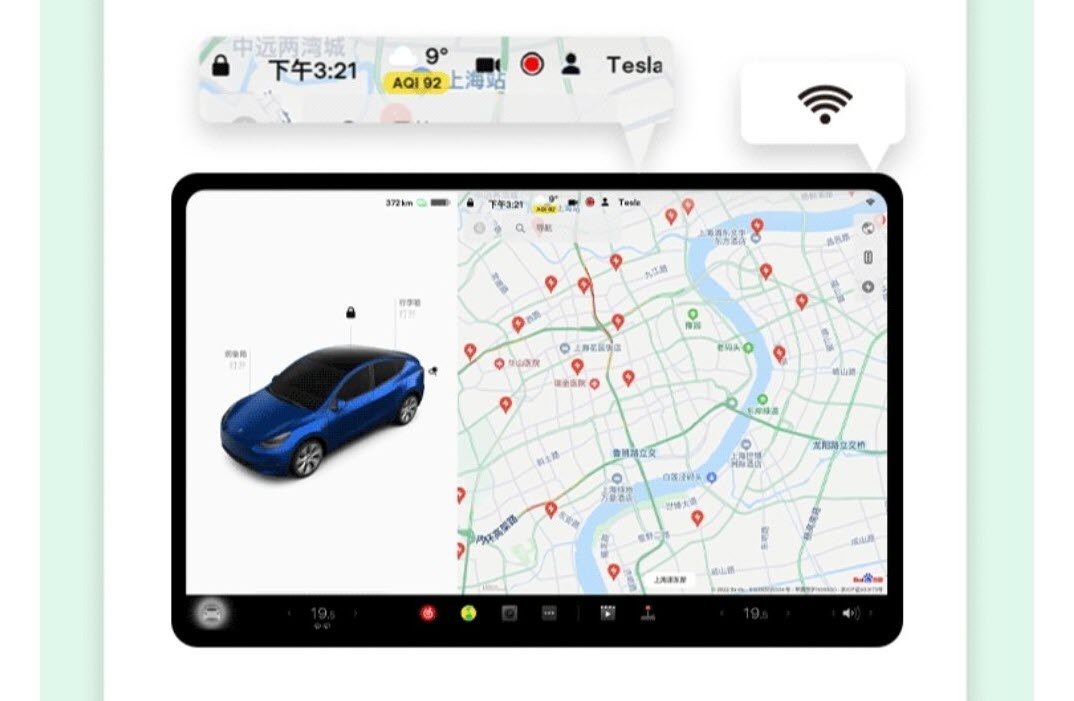
Have you guys seen this:


Looks like you may get your wish after all. Although, they seem undecided about the finalized climate control options. The rumor is they'll release apps for the functions which would be fine with me.
 
For you, Scott and others on here, not me. I'm perfectly happy with where they're at.


They cleaned up the bottom bar, and also made space for the apps and whatever future plans they may have.


Have you guys seen this:


Looks like you may get your wish after all. Although, they seem undecided about the finalized climate control options. The rumor is they'll release apps for the functions which would be fine with me.
Tesla is not making cars only for you or your ilk. If they did, they’d have been bankrupt by now. 😏

They did not ‘clean up’ anything. The bottom bar was accommodating some very important functions, which were taken away and replaced with dead space. If you think that’s ‘cleaning up’, maybe they should take all icons away! Super clean and neat, no? 🤣🤣🤣

Issues such as this UI presents would never have made it past a review committee with ergonomics experts. However, I wonder if Elon actually knows what good ergonomics are. I doubt he does.

I hope common sense will prevail, and we get back important functionality at the touch of a single icon. The UI changes in the China market are a small step, but they need to really just bring back the old UI.
 
A lot of this sounds like the Apple apologists when Apple released its MacBook Pros that only had USB C ports, no USB A, HDMI, etc. There was a chorus of complaints and the apple fans responded with a mix of "well I never use that so it's not an issue" or "honestly, you just need a dongle or adapter - it's your responsibility to make sure you have what you need!"

except a laptop isn't a 5000 lb battering ram hurling down the highway at 70 mph.
Hey, Apple brought back the HDMI port and SD reader, so there's hope :)
 
  • Like
Reactions: sleepydoc
Tesla is not making cars only for you or your ilk. If they did, they’d have been bankrupt by now. 😏

They did not ‘clean up’ anything. The bottom bar was accommodating some very important functions, which were taken away and replaced with dead space. If you think that’s ‘cleaning up’, maybe they should take all icons away! Super clean and neat, no? 🤣🤣🤣

Issues such as this UI presents would never have made it past a review committee with ergonomics experts. However, I wonder if Elon actually knows what good ergonomics are. I doubt he does.

I hope common sense will prevail, and we get back important functionality at the touch of a single icon. The UI changes in the China market are a small step, but they need to really just bring back the old UI.
It's a good thing there are guys like Elon that take a 'glass-half-full' approach to life and are not easily distracted by negativity, else we'd still be on horseback.

WE are the 'committee'. If you haven't figured out that by now, maybe a Tesla is not the car for you. You've given your feedback and they're likely to respond considering the attention this is getting.

As for the old UI coming back? I don't see that happening. They'll work on the most controversial areas to satisfy the glass-half-empty users.
+1

Thought this whole debate was done... everyone voiced their opinions, agree to disagree and maybe take a closer look at how much time people were actually spending looking at and fiddling with their screen prior to v11. Seems a bit safer now, more automated, and all the other nonsense can wait until you're at a stop, at the end of your drive, or heck, using AP. Surely, they'll add more customization to satisfy all the "controversial" (maybe misunderstood is a better word) areas... eventually we'll end up with v12 being an improvement to v11 and v10 and so on...
 
It's a good thing there are guys like Elon that take a 'glass-half-full' approach to life and are not easily distracted by negativity, else we'd still be on horseback.

WE are the 'committee'. If you haven't figured out that by now, maybe a Tesla is not the car for you. You've given your feedback and they're likely to respond considering the attention this is getting.

As for the old UI coming back? I don't see that happening. They'll work on the most controversial areas to satisfy the glass-half-empty users.

See my signature, committee. 🙂