Welcome to Tesla Motors Club
Discuss Tesla's Model S, Model 3, Model X, Model Y, Cybertruck, Roadster and More.
Register

Tesla app version 4.0.0 has app re design for both car and energy

This site may earn commission on affiliate links.
Update: OK _now_ I see it. I didn't actually try this yet.

Also I see a new blurb in the app for the Tesla Virtual Power Plant. It claims to pay $1/kWh delivered from your Powerwalls during a "an event". This apparently requires version 4 of the app.

Bruce.

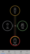
Go off grid shows in my app now too. working on multiple things atm but just wanted to confirm it was there for me now too.
 
BALANCED MODE IS GONE!!! This APP automatically changes balanced to cost savings.

Can verify. I can open the old APP on my iPad and switch to Balanced. It will remain on balance until I open the APP on my phone. Even without changing the settings, once I open this new version on my phone the settings on the old APP on my iPad changes to Cost Savings.
 
  • Like
Reactions: MorrisonHiker
Not gone for us in CA
I'm in California. What I meant was I briefly saw a change in the mobile app related to signing up for the VPP program, along with some new terms and conditions (most notably $1/kWh payment), but now it's gone. I did get some screenshots so I know I wasn't imagining this.

Bruce.
 
Amazingly the PG&E grids are not as big as they used to be, during a 3 days PSPS 3 years ago I could walk ½ mile downhill to a small mall to eat or get take out. Houses across the street is not even in the same grid as me, maybe they are in the same outage block for PSPS purpose but not for line/transformer damage. I have a V3 supercharger 5 minutes south of me and an urban charger 7 minutes north of me so no worries for me.
 
Interesting that once I updated the APP my PW immediately started charging form the grid at about 2kw for an hour until it was full, with solar going to the house and excess to the PW. It should not charge from the grid at all.

I would show you but the new APP does not allow you to select two devices to overlay their graphs (unless someone can tell me how to display that?)

ETA: Used the old APP on my iPad to show the PW charged from the grid. It did this exactly after I updated the APP
Figured out why this happened and others reported the same thing. Because there’s no more balanced option the gateway was configured to time based control once I accessed the APP. Time based control now prioritizes load shifting. Even though that’s not allowed here, the new software probably isn’t aware of that.
 
  • Informative
Reactions: jjrandorin
I actually like the new UI, more information in one screen but one might need to take a while to get used to it. Looks like the go off grid is like turning off the breaker but I would not do it while the sun is still shining and my PWs are 100%. Just a reminder if you consider doing it sometime in the future remotely, you need to pair your device with the PW (in my case iPhone and iPad) to make it happen.
With the old app, I could easily see all information on one graph out scroll down and see all production and consumption days on one screen. Now I have to toggle between 4 different graphs to see the same information.

Also with the new animation, you can no longer see the exact power flows. Before, I could tell when solar was going to the grid and the Powerwalls were discharging to the house. With the new animation, the two flows go through the meter and you can't tell where each is flowing to.
 
  • Like
Reactions: skepticcyclist
Also with the new animation, you can no longer see the exact power flows. Before, I could tell when solar was going to the grid and the Powerwalls were discharging to the house. With the new animation, the two flows go through the meter and you can't tell where each is flowing to.

Generally speaking, this Power Flow is actually more accurate. It’s not that some current selectively goes from your Solar directly to the Grid and Powerwall power goes direct to home—it’s still all one system, and your loads all connect through the “hub” that is your load center/main panel/etc.

The previous power flow just did some creative storytelling to draw the lines. 😉
 
Still on iOS App 3.10.14 here. Powerwall 21.20.6

My mode has flipped to Advanced Cost Saving when I'm sure it was Advanced Balanced before.
At the bottom of that page I now have Go Off-Grid and Pair Phone to Powerwall (which seems to be necessary for Go Off-Grid), which I don't remember seeing before.

So that feature doesn't require app 4.0
 
  • Informative
Reactions: bmah
Still on iOS App 3.10.14 here. Powerwall 21.20.6

My mode has flipped to Advanced Cost Saving when I'm sure it was Advanced Balanced before.
At the bottom of that page I now have Go Off-Grid and Pair Phone to Powerwall (which seems to be necessary for Go Off-Grid), which I don't remember seeing before.

So that feature doesn't require app 4.0
But you can still switch it back on the old APP. You can’t on the new APP. Yes, balanced still works when you switch it back. I tried it
 
Generally speaking, this Power Flow is actually more accurate. It’s not that some current selectively goes from your Solar directly to the Grid and Powerwall power goes direct to home—it’s still all one system, and your loads all connect through the “hub” that is your load center/main panel/etc.

The previous power flow just did some creative storytelling to draw the lines. 😉
That’s why I use the AutarkieMan APP. It still shows the flow
 

Attachments

  • A0160E0F-CFF9-4B57-9E2D-2BBE9B06A59C.png
    A0160E0F-CFF9-4B57-9E2D-2BBE9B06A59C.png
    349.3 KB · Views: 84
Last edited:
But you can still switch it back on the old APP. You can’t on the new APP. Yes, balanced still works when you switch it back. I tried it
Ah you're right. The help topics link seem to be for the 4.00 app, and the Time based Control section has no mention of Balanced vs Cost, so it's "deprecated".

So does that mean that since the 4.00 app now knows the exact TOU pricing the gateway can make better decisions than the old Balanced?
 
Ah you're right. The help topics link seem to be for the 4.00 app, and the Time based Control section has no mention of Balanced vs Cost, so it's "deprecated".

So does that mean that since the 4.00 app now knows the exact TOU pricing the gateway can make better decisions than the old Balanced?
I’m hoping. But when I opened the 4.0 version of the app during my shoulder period the flow switched from solar going to the house and excesss to the grid, as it does with balanced, it changed so all solar goes to the grid and PW to the house, as it does with Costsavings. I then had to open the older APP on another device and switch it back to balanced
 
I think I'm officially old. my biggest complaint are the tiny font sizes. I would also like to get the overlay graphs back -- I often would keep solar and Powerwall graphs up together...
Having used the new version a bit more, I'm feeling mixed on the changes. I like much of the new "look" and appreciate some of the new features. For example, I like how the backup % slider is now just a single one vs having the setting in multiple places (they inverted the process flow...). Being able to go off grid from the app is also nice (and now explains why that showed up in the Powerwall web page last month...). I also like that it shows how many hours of battery are remaining when you are off grid (its based on current home draw, so bounces around -- maybe add an option for instant or some sort of averages -- perhaps 5, 15 or 60 minute intervals?).

But some of the design details are honestly horrible:
  • The house/flow diagram looks nice at first glance (and as Bruce pointed out using the Powerwall green line to display % full is a nice touch). But all the details are way too small -- especially the text. The kW #'s need lines and labels to indicate which one is which -- makes it much harder to see at a glance what the system is doing (the flow is still there, but the numbers are no longer in a + pattern...). I really appreciated the simplicity of the old flow graph -- looked great and was very easy to interpret at a glance. I would suggest zooming in a bit on the house and use a little bit less 3D perspective -- get rid of the 2nd bank of panels for example. That would make the Powerwall bigger (so the % graph isn't so tiny), and also give room to put the kW numbers on or directly next to each of the 4 quadrants.
  • A lot has been said about the graphing screen. From a design point, there are a several things that really hurt it:
    1. The scale and legend is now on the right side of the graph takes up about 25% of the width of the screen -- giving less room for the graph. The "power production" or "power usage" labels could easily be moved above or below the graph (or removed entirely -- I think we get what each graph is...), giving more room for the actual graph.
    2. The scale only has peak, 0 and trough (for Powerwall charging or sending to grid) reference points and no longer has intermediate scale points. Makes you have to guess at how much output at any particular time during the day.
    3. The scale is dynamic based on which "source" is selected, so the top of one graph is not the same value as another graph. Makes it harder to compare -- especially since you can no longer select multiple overlays to see what's going on.
    4. There is a new toggle switch in the top right that kind-of gives overlays... but its not clear what that does other than the colors on the graph change to show the destination of production/grid draw or the source of power when looking at the whole home -- which is actually a very nice feature. But the toggle switch looks like an old audio equalizer and just is not clear what its for...
    5. Switching between day/week/month/year moved from being a down arrow near the "Today"/date label where a drop-down menu let you select which time period, to a separate toggle switch that shows what is selected. This is just bad use of space -- the old method was easy to find and use, and now I just get another button on the screen...
    6. Many of the touch targets / buttons are much smaller -- the icons for each source are less than half the size. I didn't feel they were in the way on the old UI. The new icons are also darker and harder to read (especially the grid "tower" icon -- dark gray on a black background is very hard to see)...
    7. I really miss the old-style overlays -- I usually kept solar, Powerwall and grid turned on and would often toggle between them to see what was going on...
I really hope Tesla is reading these comments and works on fixing some of this -- the app is not as easy to use or understand as the old version...
 
Last edited:
  • Love
Reactions: MorrisonHiker
  • Like
Reactions: MorrisonHiker