Welcome to Tesla Motors Club
Discuss Tesla's Model S, Model 3, Model X, Model Y, Cybertruck, Roadster and More.
Register

Unofficial Tesla UI (user interface) Concept - Model S - redesign

This site may earn commission on affiliate links.
Hey everyone! This is a really nice forum so I wanted to share my school project with you.
I'm Giovanni Martens, 22 years old and I am studying Graphic Design (Interaction design) in Belgium. In my third year Graphic design I had to make a final project to accomplish my Bachelor degree. My interests in cars and technology made this an interesting subject to design a user interface for. The Tesla Model S is a really nice car and I was always interested in the technology and design of this futuristic/ modern car. The big touchscreen is an eye-catcher with a really nice interaction between hardware and software. The modern technology makes it possible to implement new features and to design an interface on a whole new level. It's a new generation of in-car technology that makes it interesting to work with.

My redesign is a concept from my point of view. Based on the interface of the current software I wanted to create a modern (flat design) approach and add new elements to accomplish an updated (I hope improved) version of the UI from the Model S. I experienced the Model S in real life to feel the (display) usability and interaction with the car. It was an amazing experience where I got to know more about the Tesla and where they even offered me to make a short test drive. I want to thank Tesla Store Eindhoven (NL) for this amazing experience.

See my complete project on the designers website Behance where you can see more features and a video:
http://www.behance.net/gallery/26555733/Tesla-UI-(user-interface)-Concept-Model-S-Redesign
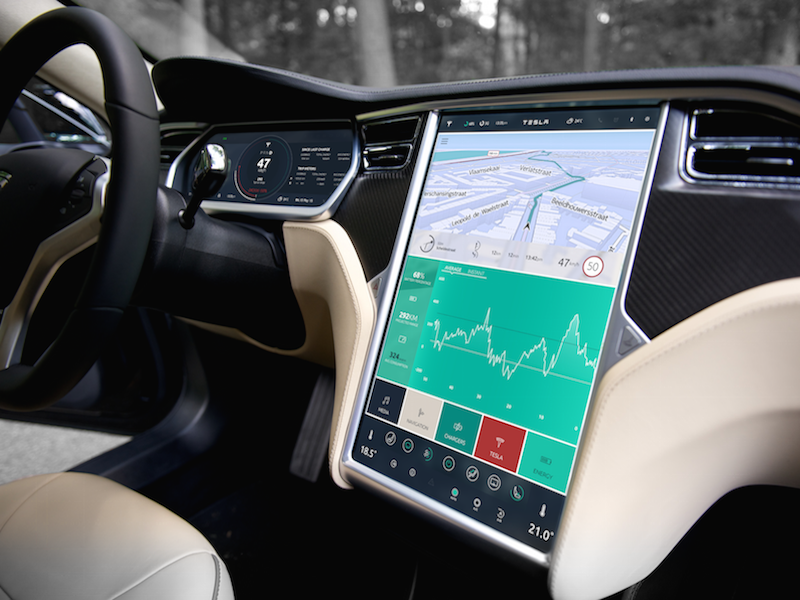
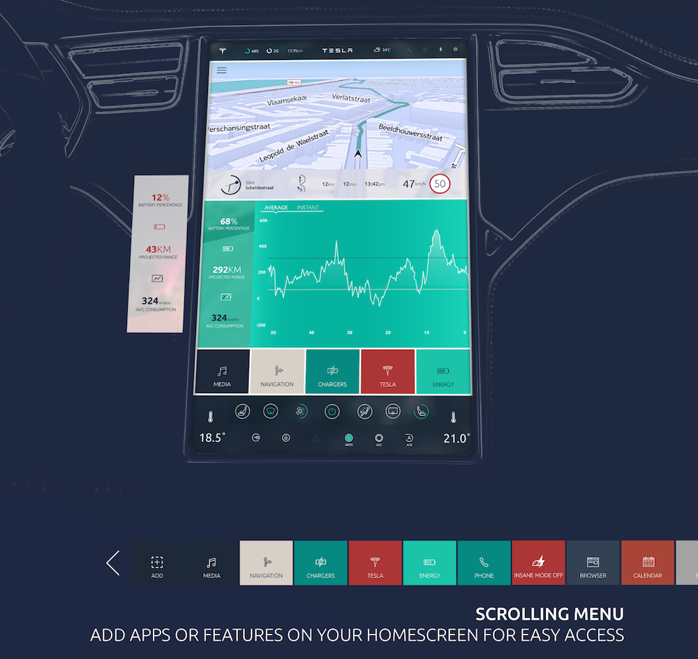
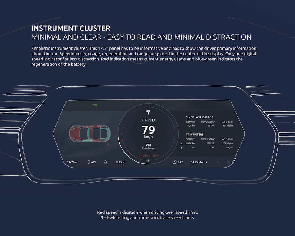
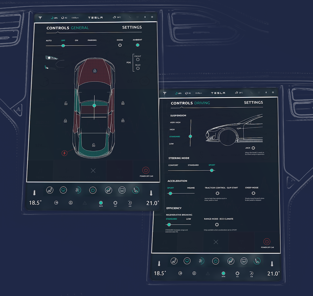
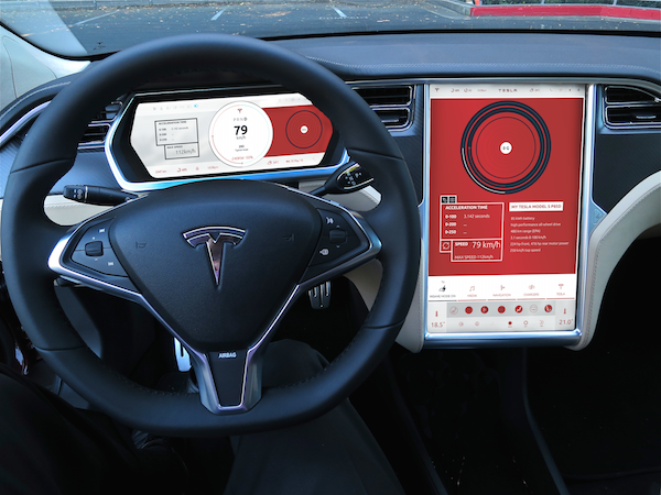
Interior photo (top) by: Craig Shipp,Craigshipp.com

presentatie_dash.png
behancep1_tesla kopie 2.png
behancep1_tesla.png
behancep1_tesla kopie.png
insane2.png


I really appreciate it if you would leave a comment so I can improve my work. What do you want to see in the future user interface of your Tesla Model S? Do you like the flat design or do you prefer the current realistic user interface? Which new features do you want to see? Is it interesting if the 'insane mode' has another and different approach of user interface design? And more... :rolleyes:

See my complete project on the designers website Behance where you can see more features and a video:http://www.behance.net/gallery/26555733/Tesla-UI-(user-interface)-Concept-Model-S-Redesign
 
There's a lot to be desired about the Model S UI's current look and feel, workflow design, and interaction design. All the beveled edges are a bit much.

But I hope Tesla doesn't pull an Apple and go all-flat like iOS. There is a middle ground and I hope Tesla pursues that.

As for this design concept, one thing that strikes me right away is less legibility than the current design. It feels like a car UI designed on a nice desktop machine with a fancy 30 inch CinemaDisplay. And it feels like a design by someone 22 years old -- and I don't mean that as an insult, I mean 22 year old in the sense of eyesight. :) A lot of Tesla owners now and in the future will be 40+, 50+. And things need to be readable.

Another issue is choice of colors. Again, it's not web, it's not desktop, it's not mobile. It's car. Cars are driven day . . . and night. These mockups look rather harsh for car driving. I personally fear I'd get fatigued pretty fast with the color schemes. Also, Red to me screams EMERGENCY. A red background not only screams OMG SERIOUS EMERGENCY but it just . . . screams. A white background is going to be a nightmare to deal with at night.

As for the dark screens showing Controls, they look too schematic and techie. An engineer might appreciate it, but I think one of the best parts of the current UI is the photo-realistic images of your actual car with your chosen trim and colors. I think that was an excellent choice on the Tesla team's part and I hope they've established it as a standard for the future.
 
And it feels like a design by someone 22 years old -- and I don't mean that as an insult, I mean 22 year old in the sense of eyesight. :) A lot of Tesla owners now and in the future will be 40+, 50+. And things need to be readable.

Wouldn't it be nice to have a range of icon and font sizes like I have on my phone! And yes, my eyes are 70 years old. My wife can't read the time or temperature on the dash, or date or odometer. Nobody seems to care at Tesla. I hope the redo will allow some choice. Matter of fact, I'd like a clock that people in the back seat could read, but would not cut into the screen maps or web or power displays. Can't do that yet.
 
One other comment: and this generally addresses ALL user interfaces regardless of the application or device, but for such a crucial UI as a car's dash and instruments, it's not what drivers "like" just based on glances to a few screen shots. Really at the end of the day, looks are not the top priority. Successfully accomplishing a task, whether it's knowing what to do and where to look for some information, knowing what to do and where to look to adjust a setting, and having the system be instantaneously responsive to the user's tasks -- providing the user with sensible status changes based on solid layout/presentation decisions, and having the system not be an obstacle due to latency like it is now -- I think those are more important always than look and feel.

If the 7.0 Tesla UI was basically the current UI unchanged, and the only thing the Tesla team did was optimize the software behind the scenes so that everything you touched and did when interacting with the system was BLAZING fast, zero latency or the illusion of zero latency -- I would be ecstatic and would consider 7.0 a triumph. (Well, that and the addition of all the multimedia/iPod/playlist/artist/song/genre/album functionality that every other new car on the planet has.)
 
Nice job - cool project. I like the "Apple-like" flat buttons myself.

One nice feature would be different user-selectable "skins" for the interface - a classy one, sport, modern/clean, etc.


That would be awesome! I would love to have the ability to change the background color and skin of the LCD display.
If there were a request box, Here's what I would really appreciate.

I would enjoy a more aggressive Re generative braking. I find that since the update 6.10~ not sure it is accurate, my tesla doesn't slow down quite as much.
As well, I am still experiencing consistent 3G outage, again yesterday while driving to and from an event only 20minutes away from my house.
Otherwise, My tesla is pretty much flawless and without any issues
I've heard of them replacing the cell unit on some cars... May want to ask about that.

I I concur with the regen - in Insane Mode the regen should be stronger as well. I would like a smooth "Eco mode" in addition to the Sport and Insane modes.
 
...knowing what to do and where to look to adjust a setting, and having the system be instantaneously responsive to the user's tasks -- providing the user with sensible status changes based on solid layout/presentation decisions, and having the system not be an obstacle due to latency like it is now -- I think those are more important always than look and feel.

If the 7.0 Tesla UI was basically the current UI unchanged, and the only thing the Tesla team did was optimize the software behind the scenes so that everything you touched and did when interacting with the system was BLAZING fast, zero latency or the illusion of zero latency...
I couldn't agree more. Ultimately, an interface needs to be functional. Drivers need to be able to locate the information needed easily and select the appropriate control without any ambiguity. There are always issues with a touchscreen in general. Its _only_ benefit is that the screen can be reconfigured by software; hardware controls don't change. However, there is always an issue with haptics. We tend to look at our tablets and phones when using them so selecting the right information is easy. With the MS touchscreen I have to look down to see where I want to put my finger, look back at the road, move my finger close to where I want it, look back at the road, press the on screen control (hopefully without hitting any bumps in the road), look down at the screen to make sure I got the right location, look back at the road, look down at the screen again to see the desired change. That's a lot of work.

As a compromise, on-screen controls need to be large, consistent, and ideally selectable without looking (e.g., always in a known location relative to the corner). And, yes, the interface needs to be fast. I have always advocated that GUIs should be built as real-time systems. The system should _always_ respond within a finite time period. There should never be any button lag.

(As a little background, I am a former airline pilot flying glass cockpits and currently design ship control and navigations systems, including their interfaces, so I do have some experience in this area.)

But great work - your prototypes show lots of promise. But be careful with the use of red, as mentioned earlier.
 
I like the flat design.

Eeww. Flat UI is the curse of this decade. I can't wait for that fad to fade.

I miss skeuomorphic UI. I have a lot of respect for Johnny Ive's, but man, I was solidly with Jobs on this one.


It's like the UI designers that come out of school today haven't seen software from the 80's, so they think - hey cool - flat UI - something new and different! And then 10 years from now, a new breed of UI designers will come around, and think, hey, look! We can make software look like real objects, with gradients and blending - let's do that!

I would hope however that Tesla knows they are not building this car for the 20-something crowd.

- - - Updated - - -

I have always advocated that GUIs should be built as real-time systems. The system should _always_ respond within a finite time period. There should never be any button lag.

Real-time is not a prerequisite for responsive UI. Your OSX or Windows mouse cursor isn't real-time, but it's responsive.
 
I do not miss skeuomorphic UI one bit and I started using computers in the 80's. We have moved past that type of design UI and it will not come back because there is no logical reason for it. It offers no additional utility, it just clutters the screen with antiquated visuals: 25 year old designers in the year 2025 will not relate to the look of a DayTimer for a list of contacts, for example.
I miss skeuomorphic UI. I have a lot of respect for Johnny Ive's, but man, I was solidly with Jobs on this one.
It's like the UI designers that come out of school today haven't seen software from the 80's, so they think - hey cool - flat UI - something new and different! And then 10 years from now, a new breed of UI designers will come around, and think, hey, look! We can make software look like real objects, with gradients and blending - let's do that!
I would hope however that Tesla knows they are not building this car for the 20-something crowd.
 
As I hinted at before, I believe there is a middle ground between skeumorphism and "flatland."

I've always disliked absurd levels of skeumorphism that Apple was horribly guilty of going all the way back to the original Mac. Apps depicting not only pictures of but requiring the same style of interactions with Rolodexes, for example. One sees this still today all over the music industry: the effects apps and plug-ins for digital music all are designed, with a fetishists's level of obsessive accuracy, to resemble the old, beat up guitar amplifiers or racks of equipment with shiny round knobs and VU meters with their needles twitching left and right.

And on the other extreme end of the spectrum, "flatland," which Jony Ive has pushed for in Apple's iOS, to me also is an overreaction to the skeumorphism on the other end of the spectrum.

I believe there is a middle way: some 3D-ishness to aid in hand-eye coordination so a driver can reach out, successfully tap some button or knob or setting, get or set the info they need, and get back to driving, all in less than a second. Drivers need to focus on the task of driving, and designers need to be focused on the TASKS of drivers.

Look and feel is always secondary. If it turns out that some sort of Star Trek: The Next Generation flatland look and feel is proven to provide the most success for the user in accomplishing tasks, well, so be it. But I'm skeptical. I think some design approach that incorporates the best moderate, selective, thoughful use of skeumorphic, beveled-edge visualizations together with lighter, flatter designs, is the way to go.

With all the army of Apple designers flocking to Tesla, I hope Tesla isn't forced to go all Ive-ish/iOS-ish on its customers. We'll see.
 
Great overall design but I really dislike the menus becoming red in insane mode. I wouldn't want the car to be all demonic with the UI colors just because I want to go fast :)

The other part I don't like is the scrolling buttons for major menu options. The top level UI options I feel should always be visible.

Nice clean UI elements though!
 
Thank you for all the comments! Really nice to hear pros and cons about the interface.
Best part of this project is that I can learn from and implement your feedback in future projects. It's difficult to make a project, especially a Tesla interface without wishes and feedback from Tesla owners. It was my purpose to launch my vision of this user interface and after that starting this discussion makes me wanna think about designing a better, updated version. It's really difficult to design such a big interface without a team and in a short-term period so I agree there will be some things to improve.
As for the reds, I agree, it's a difficult color and I think it's better to replace this one with another functional color. The font size might be indeed a bit to small but these aspects are easy to change. Some font sizes in my design are even bigger than the current UI, but I understand that people prefer a bigger font size. In my opinion it's better if each owner can choose his own preferences, font size, themes, color scheme,...
I'm looking forward to get more feedback. :smile:
 
Real-time is not a prerequisite for responsive UI. Your OSX or Windows mouse cursor isn't real-time, but it's responsive.
I'm quite aware that these OSs are not real time. But I feel real-time response should be a consideration for UI design. OK - maybe we're not talking about hard real time constraints where failure to meet a deadline is a failure of the system. Rather, response within n ms should be a design constraint. Missing this deadline should be extremely rare, and shouldn't be dependent upon other applications being installed or the amount of available memory. Again, this is my opinion and I don't see it implemented in any mainstream OS or GUI framework right now. But that doesn't mean it shouldn't.
 
I'm quite aware that these OSs are not real time. But I feel real-time response should be a consideration for UI design. OK - maybe we're not talking about hard real time constraints where failure to meet a deadline is a failure of the system. Rather, response within n ms should be a design constraint. Missing this deadline should be extremely rare, and shouldn't be dependent upon other applications being installed or the amount of available memory. Again, this is my opinion and I don't see it implemented in any mainstream OS or GUI framework right now. But that doesn't mean it shouldn't.

I agree it should be a design constraint.

The Windows 8 metro API has a few of those design elements. (Not that it's really that mainstream). Any API in Windows 8 Metro that can take more than 50m/s has to be asynchronous. And you can't take a lock on the UI thread - the API's are removed. So the idea is that everything on the UI thread should respond within 50m/s.

I think it needs to be hard rule. If any app blocks the UI thread for more than 50 m/s it should automatically be terminated, and automatically be removed from the app store.