


Welcome to Tesla Motors Club
Discuss Tesla's Model S, Model 3, Model X, Model Y, Cybertruck, Roadster and More.
Register
Install the app
How to install the app on iOS
You can install our site as a web app on your iOS device by utilizing the Add to Home Screen feature in Safari. Please see this thread for more details on this.
Note: This feature may not be available in some browsers.
-
Want to remove ads? Register an account and login to see fewer ads, and become a Supporting Member to remove almost all ads.
You are using an out of date browser. It may not display this or other websites correctly.
You should upgrade or use an alternative browser.
You should upgrade or use an alternative browser.
v11 software update SUCKS
- Thread starter Lynne Therriau
- Start date
-
- Tags
- software udpates
Agreed, this update is the worst! It creates more distractions while driving and is dangerous. There are more steps and buttons to get what you need. Good luck trying to direct a passenger what to select. The layout is HORRIBLE. And the direction of the car is not the same direction while sitting in the car, it's perpendicular. Who approved this?All the key functions I used daily are now hidden at least +1 level deep - DUMB, DUMB, DUMB.
Tesla,
- Front seat heater settings are no longer on the home screen
- Front/rear window defog buttons are no longer on the home screen
- Garage door opening prompts would auto-pup-up when I neared the garage - not anymore. Now I have to hunt for them within the new stupid screen layout.
- When my wife and/or me switched cars (phone profile association never worked), I could reset it right from the home screen - not anymore. Now I have to hunt for them within the new stupid screen layout.
Bring back v10 screen layout as an option, and quick fixing what wasn't broken!
a
P.S.: Tesla, congratulations - you've invented a way to make OTA updates capability a net negative !
CTM31991
Member
It's horrendous, nothing good to say about it, I'm all for new software and great changes, this ain't that. They need to stop wasting time and resources on arcade games and other gimmicky things that literally 99% of people dont ever use!
gnuarm
Model X 100 with 72 amp chargers
I think you mean the screen shown in this post: v11 software update SUCKS
Just looking at that picture makes me sad now. Look how easily I used to be able to turn on seat heaters and defogger!
Yeah, what was wrong with that screen that needed fixing? Why would anyone spend time fixing something that isn't broken? My only complaint with that screen was that it required changing a setting for energy display to change it from % to miles. They should display both just like they display both kW and mi/hr.
I can guarantee that no user survey told them people wanted less information on that display. "No, I don't want to know how long it will take to charge my car! Goodness me, why would I want to know that, you silly goose!"
gnuarm
Model X 100 with 72 amp chargers
the screen
If it were simply a matter of hard to *read* text, then I would at least know it's there. I have a picture on my phone, but no way to get it to the computer to show you. The info is just gone other than the current state of charge, the limit setting (only graphical, no numeric indication and it's not clear if it can be set), the cost and a Stop Charging button. They do have a link for "Supercharging Tips" with some pretty obvious advice. If this were just one view, that's fine. I don't mind pressing a second button to get the old view, but I can't find anything like that.
BTW, almost all the text in the various screens are hard to read. It's just a question of how hard and for whom.
Exelion
Member
I would also add that tapping the mileage remaining would change from the useless EPA estimate to the one displayed to the right of the graph. Or heck, get rid of the EPA range number altogether, it's not very useful. Wait nevermind, it has a use, its to show unknowing passengers how much range the car (doesn't) actually have.They should display both just like they display both kW and mi/hr.
This is a long thread, I haven't read it all. Has anyone else seen a loss of the old charging screen in V.11? I have a model X and charging tonight I can only see that it is charging, not the rate or the estimated time to complete. I thought I was simply looking at the wrong screen, but after looking at the manual, I think the manual is borked. It shows the old screen with all the info. Have they not updated the manuals in the cars???
I had the chance to commiserate with a couple who own a model 3 and Y, they both hate V.11 and have also had bad experiences with Tesla service. In fact, when the guy put his car into the Tesla body shop for an estimate, not even a repair, an employee took the car home and drove it around having to charge it several times. Seems they can turn off tracking in your app, so he couldn't tell where it was. Tell me Tesla service isn't borked!
On the first sub-versions of V11 there was nothing on the center screen at all when charging and the charge level target setting was gone. Now it calls up the charge settings screen and that doesn't turn off on its own when you drive, so you have to manually dismiss it.
The font on the instrument cluster when charging changed at some point in V 10 for me. For a long time it would flip to the smaller font sometimes, but would then revert to the larger font other times, then it stuck to the smaller font at some point near the end of V10's life.
Lets be honest here - only one person approves things @Tesla, and Elon. He is the uber-micro-manager.Agreed, this update is the worst! It creates more distractions while driving and is dangerous. There are more steps and buttons to get what you need. Good luck trying to direct a passenger what to select. The layout is HORRIBLE. And the direction of the car is not the same direction while sitting in the car, it's perpendicular. Who approved this?
Sometimes that works out great, and other times we get what we got.
I bet he liked the new screen, and the games, so we all are stuck with this crap now.

a
gnuarm
Model X 100 with 72 amp chargers
The text is there. But it's extremely small, very light gray on a white background. Hard to see even with young eyes, and basically impossible to see from outside of the car.
I'm pretty sure it's not there. If it is, they made it literally invisible. Or I'm looking at the wrong screen. This is what my car shows me now. If there is another screen, I can't find it. The screen shown in the in-car manual shows the old screen with full info.
The map directions on the autopilot screen (when the main map is hidden) have been moved from the top of the screen to the bottom. So if a passenger is searching for a song, the directions get covered now by the keyboard. This is what happens when user experience design decisions are left purely to engineers. Update 11 takes the software 10 steps back. What a mess. Does anyone know if there is a way to revert to version 10?
sleepydoc
Well-Known Member
No, unfortunately. Many people have asked and complained but once you switch there's no going back.The map directions on the autopilot screen (when the main map is hidden) have been moved from the top of the screen to the bottom. So if a passenger is searching for a song, the directions get covered now by the keyboard. This is what happens when user experience design decisions are left purely to engineers. Update 11 takes the software 10 steps back. What a mess. Does anyone know if there is a way to revert to version 10?
gnuarm
Model X 100 with 72 amp chargers
The map directions on the autopilot screen (when the main map is hidden) have been moved from the top of the screen to the bottom. So if a passenger is searching for a song, the directions get covered now by the keyboard. This is what happens when user experience design decisions are left purely to engineers. Update 11 takes the software 10 steps back. What a mess. Does anyone know if there is a way to revert to version 10?
I don't agree with your assumption that it is the engineers who decided to muck up the UI. I think the engineers would get it right, after all, there are engineers who's job it to understand how to do this right. Most companies have people in charge of the "appearance" of products and they have large clubs to swing in meetings or better, with management outside of meetings, where the decisions get made.
Professional equipment pretty much always gets designed right. Consumer equipment often has these sorts of failings when the "designers" have more sway than the engineers. By "designers", think of Project Runway.
gnuarm
Model X 100 with 72 amp chargers
We don't have scientific polling of want % of Tesla drivers 'like' voice commands. But here is some interesting reading on the recent popularity of voice commands among the readership of Android Authority (TLDR, 50% never use them, another 20% only use them once a week).
Safe to say many people just flat out dislike talking to their devices, though clearly some do like using it.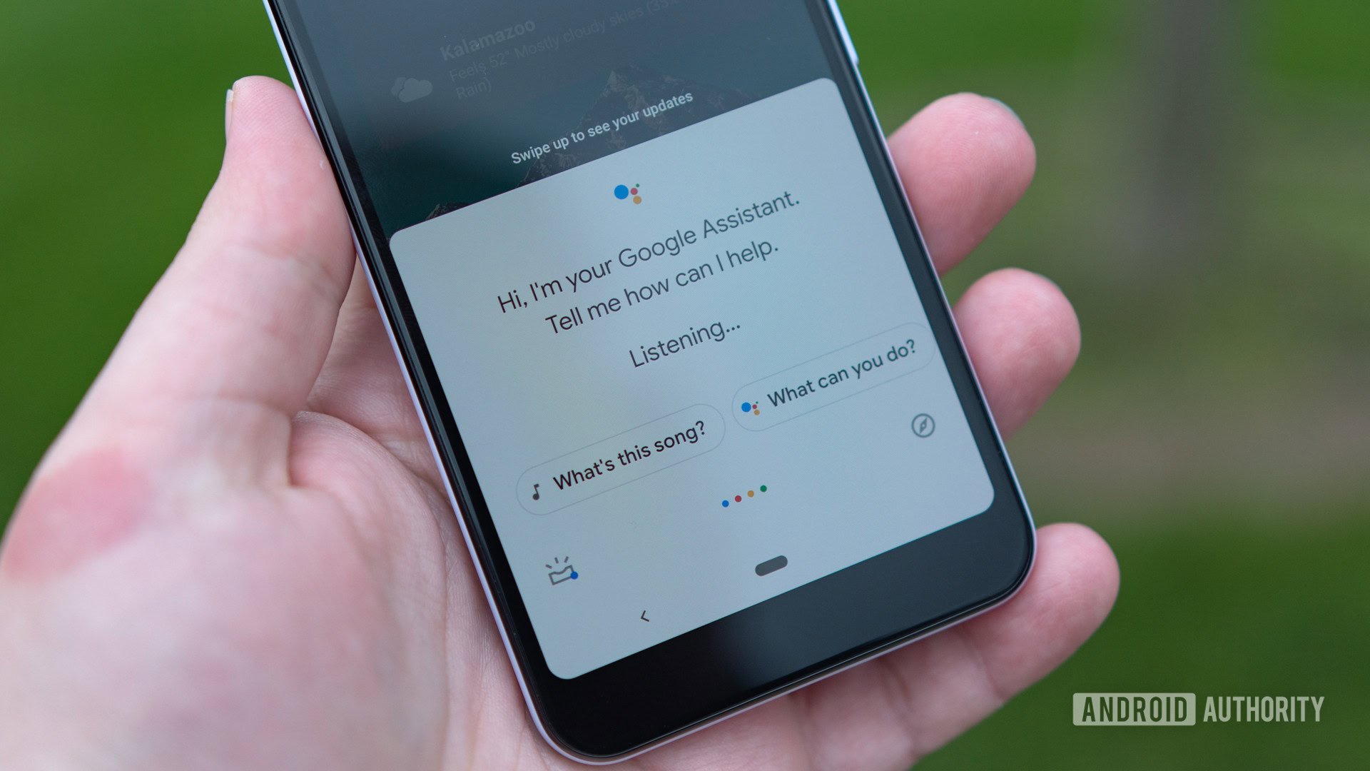
We asked, you told us: Most of you don't use voice assistants on your phones
A reader poll conducted on Android Authority has found that most people don't use voice assistants on their phones.www.androidauthority.com
I don't mind talking to devices. I use the Android thing all the time. I hate when it doesn't work, especially for stupid reasons. I have my hands busy or for some other reason, can't push the button to delay or cancel an alarm. I say, "Hey Google, snooze that alarm" and it replies, "You can do that in the app".
Is she trying to be a wise ass? If she were a person, I would fire her.
In the car, the voice control is very poor, often not understanding what I say. I've never found a list of the commands I can use. Maybe I can simply ask for that by voice, but the car would probably tell me it "doesn't know that command". I'm sure there's a doc on it somewhere. Maybe I need to attend Tesla 101 classes or something. I get tired of reading the manual every time the software is updated. I only have so much time on this earth and I want to drive the car instead of reading manuals. Hell, I actually don't even want to drive the car, but it's a necessary evil to do the things I want to do. Well, maybe I want to drive the car sometimes...
gnuarm
Model X 100 with 72 amp chargers
I love driving my Model 3. Nimble, fun and reasonably neutral at the limits (unlike my S, which means I can’t really push the S like I do my 3).
The UI was probably designed by a hipster doofus with full encouragement by Elon. Sorry, but I fully believe that’s what happened.
Elon doesn’t care anymore what the longtime fans have to say, critically. He is probably very tired after being at the helm for almost 20 years. (“I rather hate being the boss at Tesla”, remember that quote from him?)
I expect you are absolutely right about how V11 came about. You know such a change would require Musk's approval.
dgatwood
Active Member
I've only seen V11 in pictures, because they haven't pushed that abomination on older Tesla cars yet, but what I see needs some serious rethinking. Leaving half of the most usable touchscreen space (the area immediately adjacent to the bottom edge) empty is very bad from a human-computer interaction perspective. The area where controls should be most concentrated is where they are most sparse. This is exactly backwards.
Hint for Tesla's next UI: Take a look at how Apple handled the touch bar in macOS, and do something like that for the bottom row. Allow the user to choose between multiple versions of common controls, and choose which controls are shown and which aren't, and hide anything that doesn't fit behind the three-dot button. Nobody will ever agree on what should be in that row of buttons, so make it easy for users to configure it according to their own preferences. [Yes, the touch bar is also an abomination, but only because A. it was too close to the keyboard (false triggering), B. they didn't use force touch sensing (false triggering), and C. it took away tactile controls that were useful to have around all the time, in favor of non-tactile controls that were constantly changing. If they had just put it above the row of function keys, nobody would have objected. But the designers knew best. After all, nobody really needs function keys anymore, right? ]
]
Hint for Tesla's next UI: Take a look at how Apple handled the touch bar in macOS, and do something like that for the bottom row. Allow the user to choose between multiple versions of common controls, and choose which controls are shown and which aren't, and hide anything that doesn't fit behind the three-dot button. Nobody will ever agree on what should be in that row of buttons, so make it easy for users to configure it according to their own preferences. [Yes, the touch bar is also an abomination, but only because A. it was too close to the keyboard (false triggering), B. they didn't use force touch sensing (false triggering), and C. it took away tactile controls that were useful to have around all the time, in favor of non-tactile controls that were constantly changing. If they had just put it above the row of function keys, nobody would have objected. But the designers knew best. After all, nobody really needs function keys anymore, right?
]Got 2022.12.1 today. They have listened a little bit. You now have the option of adding seat heater and defroster buttons to the bottom buttons. That's at least a minor improvement.
father_of_6
Membler
But only the driver's seat? And the defogger doesn't actually work unless the fan is already blowing?
Are those true? I haven't gotten the update, but if those are true, the folks in charge are hopeless.
Are those true? I haven't gotten the update, but if those are true, the folks in charge are hopeless.
SDRick
Active Member
Also got 2022.12.1 today. Certainly an improvement but still rather limited. AFAIK the right scroll button left and right functions are still disabled.
Why is it so difficult to at least bring the "cards" back in the driver screen. As many of you know, what was once visible and nicely displayed in the driver screen (trip efficiency, tire pressure etc.) now takes up the whole entirety of the center screen. Why?
With such a large screen why is it so difficult to allow or hide as many icons a user chooses?
A screen interface is already difficult or dangerous enough on twisty, fast-moving, busy or bumpy roads. Menus under menus or icons that disappear or move position for often used functions is an insult.
Last edited:
But only the driver's seat? And the defogger doesn't actually work unless the fan is already blowing?
Are those true? I haven't gotten the update, but if those are true, the folks in charge are hopeless.
When I selected the seat warmers it showed up for both passenger and driver. I haven't driven the car since the update. I also have a Model S, it may be different on the 3/Y.
Also got 2022.12.1 today. Certainly an improvement but still rather limited. AFAIK the right scroll button left and right functions are still disabled.
Why is it so difficult to at least bring the "cards" back in the driver screen. As many of you know, what was once visible and nicely displayed in the driver screen (trip efficiency, tire pressure etc.) now takes up the whole entirety of the center screen. Why?
With such a large screen why is it so difficult to allow or hide as many icons a user chooses?
A screen interface is already difficult or dangerous enough on twisty, fast-moving, busy or bumpy roads. Menus under menus or icons that disappear or move position for often used functions as an insult.
I do wish there were more physical controls. The touchscreen is not great for functions you need to access without taking your eyes off the road.
Similar threads
- Replies
- 7
- Views
- 549
- Replies
- 3
- Views
- 310
- Replies
- 13
- Views
- 2K
- Replies
- 105
- Views
- 16K