Welcome to Tesla Motors Club
Discuss Tesla's Model S, Model 3, Model X, Model Y, Cybertruck, Roadster and More.
Register

Model S Weekend at Santana Row Video & Photo Links

This site may earn commission on affiliate links.
These are the Signature performance samples. When setting the white balance to the gray card, I left them a slight touch warmer than perfect gray (2900 instead of 2850), as in most light sources the colors will look even warmer. However, the artificial light may have an influence that can't be corrected by just the white balance. Whenever I make another trip to Santana Row or Palo ALto, I'll take the photos along, and compare them to what I see in the store. However, the light in the store is different than daylight... perhaps the best would be to take photos in daylight on an overcast day... point being, even in reality the colors will always look different depending on the situation.
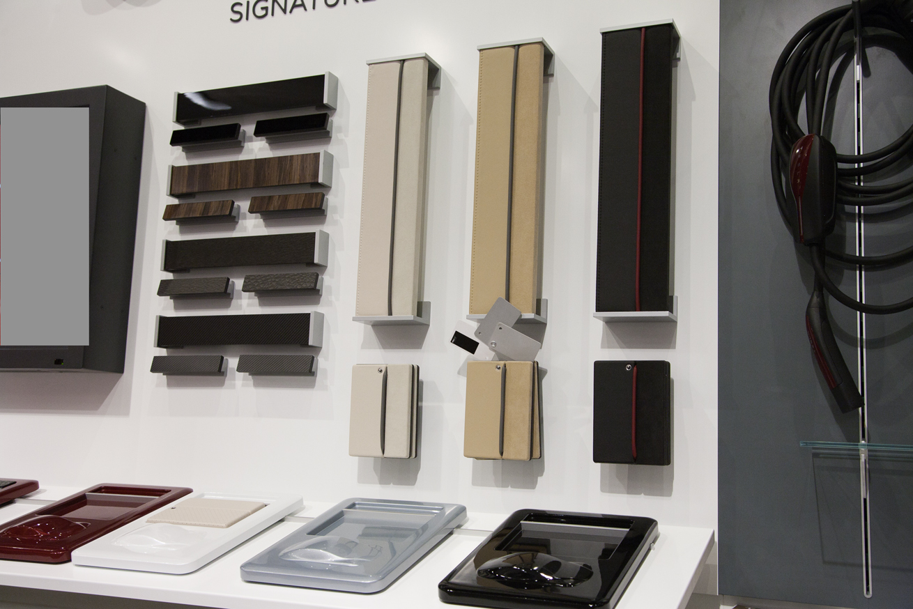
_MG_1034.jpg
 
I was in Menlo Park dropping the Roadster off for service, and wandered inside to look at the chassis and the Model S design studio setup they have there. There's much more natural light there, so thinks were a bit warmer. Also, I think your picture does great at showing that the small samples are at an angle and catch the overhead lighting - thus the lacewood and CF 'shading' differences. The samples of the lacewood were actually very consistent. And your picture does a good job of representing the (IMO) bleh-ness of the banana leaf, which looks much warmer in the design studio.
 
I wouldn't worry too much about what degree kelvin to illustrate the samples. We don't know how neutral the windows and panoramic roof aren, and grey cards can vary by manufacturer, lot #, and age. As long as its somewhat neutral, it's more important to illustrate the colors relationship to each other.
 
I suppose a greater ideal would be to shoot them with a Macbeth color chart. But again the real life light will be in constant flux.

I do have one, but thought it would be overkill since it doesn't help that much with artificial light. Maybe because it doesn't have the full spectrum and you can't add what's not there. ;) To be honest, I stopped using it a while ago.
 
The important take-away from me is that the tan leather is apparently far less yellow/orange than it shows in the Design Studio. For those who've actually seen the samples, is that correct?

In the Design Studio, the headliner has a distinct yellow cast. Is that true in RL?

I think "tan" is a good description, but I'm slightly color blind... Agree that the design studio is a bit off.
 
I am VERY, VERY suspicious about Tesla's winter testing in Minnesota (the silver one referred to in the George interview video at 1:03). We absolutely did NOT have a winter this year - no cold, no snow.

The Tesla stores are now showing video of the Model S winter driving test as part of their overall video loop. The car in the video had the 21" wheels with performance tires and still looked like it was handling things pretty well. Makes my move from quattro to the Model S a little less scary. Here's one snapshot I took of it:

photo (1).JPG
 
Are you saying that the samples at Santana Row included dark brown lacewood sample even though the on-line Design Studio only includes a Black (or perhaps grey) lacewood option? I would think brown lacewood would look great with a tan interior.

Thanks.

Larry

Forum member BYT_P1,837 took the following photo of beta VIN#23. The lacewood trim looks brown to me contrary to the Design Studio which shows all lacewood as charcoal grey or black. So I am somewhat confused as to what Tesla is doing by displaying a trim that is not available in the Design Studio.


photo_01.jpg


Larry
 
Forum member BYT_P1,837 took the following photo of beta VIN#23. The lacewood trim looks brown to me contrary to the Design Studio which shows all lacewood as charcoal grey or black. So I am somewhat confused as to what Tesla is doing by displaying a trim that is not available in the Design Studio.

This photo may have a strong yellow/brown color cast, the camera color correction seems to try to make the screen look white. On the photo 3 messages above (Model S in snow), there is the opposite effect, where the color correction is trying to make the area around the screen white (or average the two), resulting in the screen looking very blue.

I think Lacewood might have a very slight brown tone, though.

It is a little darker in this picture then live, it was definitely brown and not any shade of grey. For the record the photo was taken on my iPhone 4S and I didn't run it through any filters at all, honest... :)
 
It is a little darker in this picture then live, it was definitely brown and not any shade of grey. For the record the photo was taken on my iPhone 4S and I didn't run it through any filters at all, honest... :)

Usually any conversion to the jpg format involves some (in this case automatic) color correction, choice of white balance. If you look at the photo, everything around the screen has a brownish tone. That's not a bad sign or anything, because different parts of a photo (for example sun-exposed vs. shadow areas) often require different white balance, but only one can be chosen (unless you double-process with photoshop). So in situations that require different white-balance, either one or both areas will be off. Human perception usually compensates in complex ways. But again, I do remember Lacewood to be very dark but slightly brownish, maybe it is more brownish than I remember, but one should not expect a photo (especially one made without gray card or any other attempt to calibrate color) to easily give "true" color. There is even a difference between "true" color and the colors different humans would see in a given situation. I might post two different versions of the same photo which show both the inside and the outside (though the window) of a Tesla shop, to illustrate that. In it, either the inside will have a yellow cast, or the outside a blue cast, depending on choice of white balance.
 
Last edited: