Welcome to Tesla Motors Club
Discuss Tesla's Model S, Model 3, Model X, Model Y, Cybertruck, Roadster and More.
Register

Poll on V11 interface

What is your overall take on V 11?

  • I like its organization and customization a lot but its graphics are clunky. But function over form.

    Votes: 104 14.5%
  • I love it and it's a huge Improvement in every way.

    Votes: 149 20.7%
  • I I hate it and everything about it– wish I had not installed it.

    Votes: 395 54.9%
  • I like its organization/customizability but its graphics are so bad it's overall a step backwards.

    Votes: 71 9.9%

  • Total voters
    719
This site may earn commission on affiliate links.
I’d love to see a ‘side’ panel that is customizable and has the buttons/icons based per ‘event’ or ‘need’. Winter mode, trip mode, rain mode, highway, etc. Even maybe ones based on geolocation. These could also be further refined to include pre-selected settings (volume, temp, audio source, suspension, lighting, etc). Different aspects per each need. Somewhat similar in principle to the new profiles in iOS. As a plus, stored on the cloud so you could have your familiar environment in any Tesla.

I haven’t even seen V11 so maybe I’m completely off track and some of this already exists.
 
Last edited:
So many of the responses on this thread say things like "why does that need to be good?". Those types of posts aren't helpful. My opinion is that every part of the UI should be the best it can be. I won't say that v10 was perfect, but I'm struggling to find even one thing that improved with v11, and see *many* things that are much worse. I've also not seen any posts that adequately rationalize any of the choices made in v11.

Like some others, the M3 has turned my long commute from a punishment into more of a privilege ("yay, I get to drive to work"). With v11 though, it's like someone moved all of my heater knobs into the glovebox in the middle of winter.

My opinion of the Model 3 has gone from very high to very low with a single software update. I genuinely feel like someone has ruined the vehicle.
For a car worth more than $100k the UI should be highly customizable or, at least, stay the way it was when I bought the car. The fact that we are arguing about new UI does not spell “luxury”.
 
So many of the responses on this thread say things like "why does that need to be good?". Those types of posts aren't helpful. My opinion is that every part of the UI should be the best it can be. I won't say that v10 was perfect, but I'm struggling to find even one thing that improved with v11, and see *many* things that are much worse. I've also not seen any posts that adequately rationalize any of the choices made in v11.

Like some others, the M3 has turned my long commute from a punishment into more of a privilege ("yay, I get to drive to work"). With v11 though, it's like someone moved all of my heater knobs into the glovebox in the middle of winter.

My opinion of the Model 3 has gone from very high to very low with a single software update. I genuinely feel like someone has ruined the vehicle.
See my earlier post . I’m not saying if it’s good or bad but I strongly suspect the changes were driven by new user feedback … hence making everything more logical at the expense of clicks … to lower the new-user “I cant find xxx” complaints.

On The subject of logical layout, I don’t see why the mirrors/steering wheel buttons (which are way too big) should be on the controls screen. Seems to me these are really better on the (badly named) ”Pedals and Steering” menu (which should really be “Driver Setup” imho). That would free up space in the Controls screen for stuff that is more day-to-day.
 
The new interface basically makes the car more dangerous to drive. It's winter in New England. I need easy and immediate access to the defrost buttons as an example. How about turning on the lights? My wife is supper pissed off at the Tesla because she can no longer easily select who is driving the car. No warning about the changes. These types of safety changes should have been communicated WAY before the software was pushed. There should also have been links to training material/videos.
Very bad from a safety point of view. I'm surprised the NTSB is not on there case.
 
I’m done listening to all the whining. Thoughts and prayers for everyone’s additional clicks.
A car is a potential death machine. That's objectively true, and not an over-reaction. It's not like we are complaining about a phone or computer OS overhaul. Things on the road sometime happen faster than you can react, even with your undivided attention. Add distracted driving - a proven thing - and each extra click increases distracted driving. I don't understand how anyone can honestly dispute that.
 
A car is a potential death machine. That's objectively true, and not an over-reaction. It's not like we are complaining about a phone or computer OS overhaul. Things on the road sometime happen faster than you can react, even with your undivided attention. Add distracted driving - a proven thing - and each extra click increases distracted driving. I don't understand how anyone can honestly dispute that.
It’s an extra click when not driving. When driving it’s an extra interaction. Eg when driving I don’t stare at the panel long enough to do 2 clicks as 1 interaction. It glance at it, make a click. Glance back at the drive/road and then a bigger/longer glance back at the panel because (at least atm) the area to look at is less known and a second click that may or may not require a little more attention to make.

Similar issues with the streaming options but generally you can postpone those to a time of your choosing.

Also... when the buttons are anchored on the bottom, they're easier to push from muscle memory.

Not only are those important functions behind a menu, they're smaller and in the middle of the screen. I wouldn't buy this car again. V11 reduces the value of the vehicle.
 
I wouldn't mind it so much, IF vision only AP and/or even cruise control wouldn't be so finicky

but alas, vision only AP and cruise control (love those phantom braking on cruise control when a semi is passing by in oncoming lane) makes more interaction with the screen pretty dangerous while driving
 
  • Like
Reactions: Boza
Fanboys will deem this a gross overreaction, but I've had a similar change in how I "market" the car. Before v11, I was letting my friends (and even strangers) test drive my car, always touting the greatness of Tesla products, and urging people to consider buying one. Now I'm more reserved when discussing Tesla, because I'd feel bad if one of my buddies spends $50,000 on a Model 3 and then realizes he can't even see the trip odometer and the map at the same time. I'm still on the EV bandwagon and touting the superiority of electrification, but just less likely to solely recommend Tesla. The UI is the core of the user experience in a Tesla, so it's gotta be great. And it's not right now.
Yep. I was a huge advocate. But I’ve toned it down since the switch to Tesla Vision. This is another setback. Seems like Tesla keeps making it harder to do very basic things that most drivers would expect to be able do without thought or a lot of fiddling.
 
Fanboys will deem this a gross overreaction, but I've had a similar change in how I "market" the car. Before v11, I was letting my friends (and even strangers) test drive my car, always touting the greatness of Tesla products, and urging people to consider buying one. Now I'm more reserved when discussing Tesla, because I'd feel bad if one of my buddies spends $50,000 on a Model 3 and then realizes he can't even see the trip odometer and the map at the same time. I'm still on the EV bandwagon and touting the superiority of electrification, but just less likely to solely recommend Tesla. The UI is the core of the user experience in a Tesla, so it's gotta be great. And it's not right now.

Same here. I've given dozens of test drives, even to strangers. I'm done with that though. The UI is embarrassingly bad.
 
I get where you are coming from, but most of the things you mentioned used to be available WHILE the map was visible. Some people want to see the map for various reasons. I would much rather see a map than have it taken up by the 'driving' screen, even if just to give me fair warning about upcoming turns. I also don't see any audio controls on the 'driving' screen(which is proper, they aren't driving controls), and in the past I could have everything I wanted to be accessible at the same time, including the map and audio controls.
I’d be happy if they made a half screen controls panel with smaller buttons, similar size to the middle media player. If you could customize that with car controls, and maybe show/hide it easily, I’d be very happy.
 
Here’s a radical thought: should defroster and defogger have actual buttons either on steering wheel or dash? I know, I know, absolute heresy. But if there were physical buttons somewhere, the UI team could do whatever they wanted without adversely impacting (or just changing around) their menu structure.

Sorry, moment of delirium this morning.
 
Last edited:
From another thread but exactly one of the point I was making:

I just had a seriously scary moment with this lovely v11. It started raining at -4c which means that the windscreen freezes solid in seconds. This was on a dark, winding road and I had to start finding the window defroster tiny button from some pop-up dialog while trying to keep the car on the road.

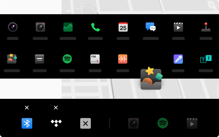
Now Tesla - I can get a TOYBOX in the quick launch but not safety critical windshield heating??
 
This is a poll on version 11 which is the most radical overhaul and reorganization of the screen and computer interface in years. It appears however to have garnered mixed if not polarized reviews. This poll is an attempt to capture people's overall assessment of this update. Please do feel free to provide comments and details about your assessment of its pluses and minuses. Hopefully Tesla is listening and some of the minuses can get trimmed out in future updates.
Thanks for the poll. However, it does not capture those of us who are ok with the graphics, but take issue with the organization and placement of functions.