Welcome to Tesla Motors Club
Discuss Tesla's Model S, Model 3, Model X, Model Y, Cybertruck, Roadster and More.
Register

Suggestions for V11 Rework/Improvements

This site may earn commission on affiliate links.
In other words - bring back V10?!
Well, yes.
Here's a list of what we got in V11:
  • Light show - ok. kinda cool but worthless in terms of driving. Most people don't care about it
  • Dark Mode - A new color scheme. The screen would already darken at night is this is of minimal benefit
  • "updated navigation" that allows you to add stops and "hide map details for a clean, simplified look"
  • Games (sonic, Tesla arcade, sudoku, and battle of polytopia) - I bought a car, not a playstation.
  • Entertainment - TiktTok, Boombox megaphone - see above.
  • Immersive audio with an adjustable subwoofer - Personally I haven't noticed a difference. I haven't seen many people raving about this but have seen a couple of complaints. Maybe it's better?
  • Cold weather improvements - I haven't actually noticed these and I live in MN. We had a high temp of -3º F the other day, so I can't say that these are of great benefit.
  • Blind spot camera - some people like it. most people seem to think it's of limited utility. Personally I find it to be a very poor implementation and my view is blinded by glare from the blinkers at night but if it helps some people, great.
  • Maps - adding and editing your route is a nice upgrade. I don't use it much at all in daily driving. On the flip side, they took away the estimated battery life, the icon to change the map view and the ability to see directions when the right screen is covered. These are features that were useful every time you used the map so overall the map is a downgrade.
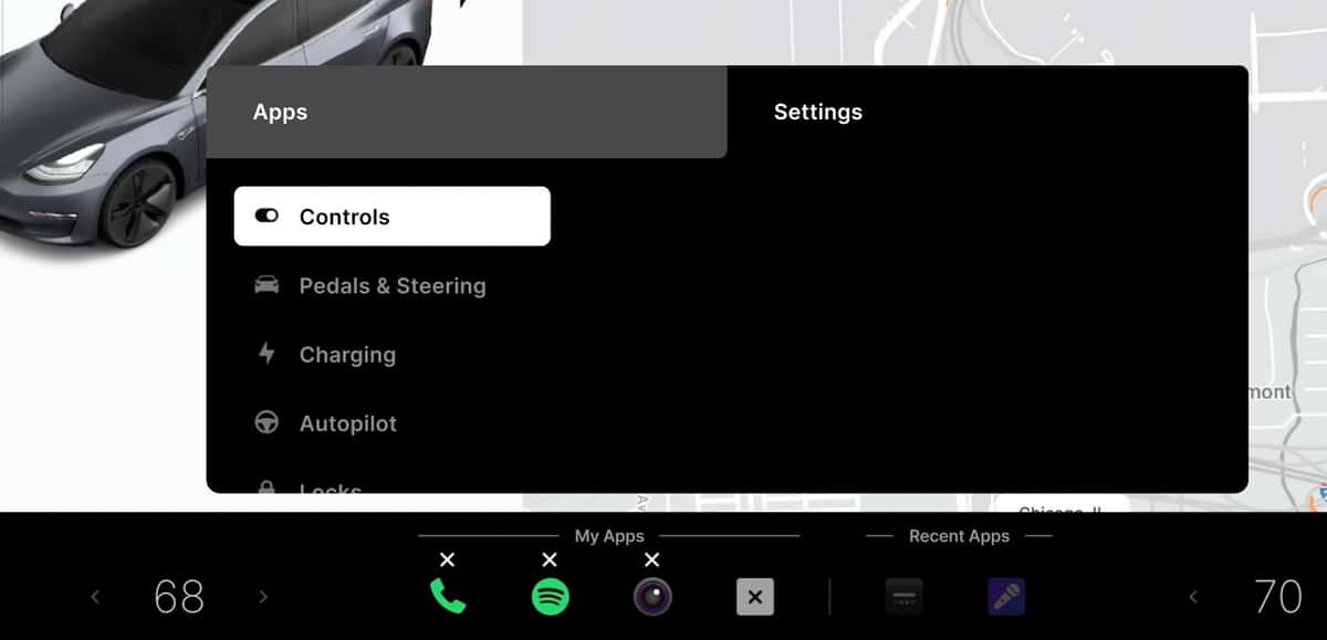
  • A new UI with "a fresh digital look," Customizable app launcher and a simplified controls menu
So far we have a bunch of minor improvements and an improvement combined with worsened utility of the map and the the blind spot monitor.

The audio options really don't add anything and actually make it harder to use at times because they took away the combined audio screen and split it into 5 separate ones.

The "clean digital look" seems to mean they changed the colors and removed a bunch of stuff from the main screen. Personally, I think he new colors are cheesy. That's personal preference and I can easily get over that. They're also a bit harder to read but again, nothing I can't get over. The AutoPilot and cruise icons are smaller and hard to see. The speedometer is harder to see. The odometer and trip odometer are now harder to find and see. As are the tire pressures.

That leaves us with the new UI. What did we get? The ability to customize the app tray with up to 4 'apps', but half of the apps are games, ticktock, a web browser and other items that don't belong on the display while you're driving.

They took away items like the seat heaters, wipers and defrost that people use on a regular basis but don't give you the opportunity to put them back with the 'customizable app tray.'

So yeah, V11 gave us precious little in terms of improvements and virtually nothing that really helps or even matters but it made virtually everything more difficult to use.
 
Superchargers are now available by hitting the navigation search bar and then clicking charging, but this is not active while driving on a trip, as far as I can tell (I might be wrong, happy to learn if I am).

To see Superchargers while driving on a trip, please try these tricks mentioned in other forum threads.

(1) Tap the button to add a waypoint, then you should get the nav search bar with its charging button.

(2) Use the voice command "show Superchargers", assuming you have a good cell signal and no passenger asleep.

[I can't test them since I'm sticking with V10 for now.]
 
Actually, I think it’s a more useful blind spot monitor than the camera system they just introduced.
Yes! Sometimes the visualization is an excellent BSM tool. Problem is, the vehicles are only spastically there and often disappear and reappear based of algorithm confidence fluctuations. It’s almost like a wave function showing the probabilities of a car being found at any given point. Still, I love it and enjoy watching how my car perceives it’s environment.

Honestly, I wish there was an option to display the track data tags for each of the vehicles in some sort of “geek mode”, but I suppose that might be distracting. :)
 
Last edited:
1. Seeing supercharger stations near me while driving. This was available before. Superchargers are now available by hitting the navigation search bar and then clicking charging, but this is not active while driving on a trip, as far as I can tell (I might be wrong, happy to learn if I am). I was on a 9-hour drive last week, and given low temps, wanted to be able to see superchargers around me when my range dropped, but didn't know how to do this.
On a recent road trip (V10 UI) to the US, I noticed that Superchargers sometimes did not appear on the map as I drove by. I was used to always seeing them show up as I got closer when driving in Canada and it struck me as odd that this didn't alway happen.
 
  • Like
Reactions: RNHurt
Here’s another idea - if having blank space instead of seat heater Icons is so important, have the seat heater icons disappear when the temperature is above 50º

That makes the feature hard to discover, like hiding the tire pressure display until there's a reading and the mobile signal indicator when there's a signal. Also, some people use the seat heaters to relieve back pain.

This is subtle but experienced designers should figure this out or at least discover it via testing.
 
What I like about v11:
  • Blind spot camera on turn signal
  • North-up indicator moved closer to the driver
What I liked about v10:
  • Dock icon design befitting a $60k+ vehicle. Clean, tidy, and a little subtly fun at times like the ye olde telephone. Mainly, any icons that that don't look like they were ripped from Android or an old version of Windows.
  • One button for HVAC. I don't need two taking up space. One car, one temperature.
  • Seat heater buttons and windshield defrost buttons just right there. The latter is a safety function.
  • Controls that turn each seat's heater on and off when tapped. Seriously.
  • The only (big) slider was for brightness. There were up/down buttons for everything else, including HVAC fan speed. Buttons are way easier to hit when you're driving, rather than trying to precision-drag a slider while bumping around on the road.
  • Big, cleanly laid out buttons (no sliders) in the HVAC controls.
  • The speedo had a slightly larger typeface and looked more nicely designed in v10. (Not surprisingly, I think it looked even a little better pre-v10.)
  • Trip meters available all the time without obscuring the map. Seeing your energy use is critical for making it to your far-away destination when it is below -25C, like it was here for the last 3+ weeks. Tapping hither and yon to switch between energy and the map is distracting and isn't necessary, as v10 proved.
To me, it seems like a ton of change for zero reason, mostly changes for the worse. Tesla, can I get v10 back, but keep the blind spot camera and the north-up indicator?
I'm going to guess that the trip and TPMS cards were sacrificed to make that space available for the blind spot camera, so not an arbitrary change. From comments I've read elsewhere, I'm optimistic that some of the buried controls might be made available to customize the launcher. I'm prepared to hold onto V10 in the hope that some compromises can be implemented in the coming weeks. Fully agree on the topic of sliders vs -/+ buttons, particularly since the newer Tesla models do not have a very smooth ride. There is an existing temperature control slider in V10, but temp can also be selected with </> buttons.
 
I'm going to guess that the trip and TPMS cards were sacrificed to make that space available for the blind spot camera, so not an arbitrary change. From comments I've read elsewhere, I'm optimistic that some of the buried controls might be made available to customize the launcher. I'm prepared to hold onto V10 in the hope that some compromises can be implemented in the coming weeks. Fully agree on the topic of sliders vs -/+ buttons, particularly since the newer Tesla models do not have a very smooth ride. There is an existing temperature control slider in V10, but temp can also be selected with </> buttons.
Possibly, but they have no problems hiding other information with the blind spot camera, so removing the cards just for that wouldn’t make sense. From a practical standpoint, the blind spot cameras are only on when your turn signal is on (Assuming you haven’t disabled the feature,) so the cards would only be obscured for a short time, and generally not at a time when you’d be looking at them.

What I don’t get is they essentially made a big blank space at the top of the screen that’s never used for anythign. Why?
 
On the navigation map, you now have to press the "pin" button to see supercharger locations. Also, when you zoom out, the supercharger locations go away. Really stupid that they changed this. Have to zoom in pretty far out to see the supercharger locations which is annoying when trying to see the options 100-200 miles down the road.

Also the fan is now a sliding bar rather than the plus or minus buttons. Much more difficult to change while driving. Who thought this would be a good change?
 
Also the fan is now a sliding bar rather than the plus or minus buttons. Much more difficult to change while driving. Who thought this would be a good change?
Agreed. Sliders are terrible. Much more difficult to adjust with any precision.
The temperature has also been given a slider, but fortunately the discrete up and down arrows are still there as well. The equalizer sliders are equally difficult.

In general I think it is best to have discrete up/down buttons with tactile feedback for all inputs. Tesla's steering wheel dials do a great job at this. For example, when adjusting the TACC speed we know that each click of the wheel is 1 MPH. Imagine how difficult it would be to set this speed with a slider!

So since this thread regards suggestions for improvements, my suggestion is the all sliders also include discrete up/down arrows or get temporarily mapped to one of the steering wheel dials during the adjustment.
 
That was in jest, of course :)
I think allowing to dock important car functionality (e.g. defroster, seat warmers, etc.) - similar to how we can dock apps - would be a great step in restoring functionality lost with the upgrade. Of course, there are many other issues (that would have been discovered during proper UAT) but that would be the first they would need to tackle.
Also, I would love to have the option not to download bloatware - games, farts, fireplaces, etc.
My list:

- more professional looking icons
- more icons to choose from
- Audio blind spot warning
- larger font/pt size throughout
- numerous usb/Bluetooth entertainment improvements including album data, larger cover art imagery, elapsed time, better sort/search, return to last source played,
 
No more chimes please. So many chimes, bings n bongs in the car as is …. no f**kin idea what most are for and I’d quite happily silence them given the option🤣🤣

Heh. Good points.

Now that the owner's manual is in web form, it has some animations. It could easily have a section that can play the warning chimes. Also, the car could display a message along with each chime.

(I find the speed warning chime is helpful but I wish it was less intrusive sounding.)