kael13
Member
Not entirely sure if this was the case before but post-update autosteer definitely can't handle junctions on the A5 (a dual carriage-way). Driving past them, it flips out.


You can install our site as a web app on your iOS device by utilizing the Add to Home Screen feature in Safari. Please see this thread for more details on this.
Note: This feature may not be available in some browsers.
 . Before I could easily choose different sources
 I had the same issue but then later found out there is a new source called Bluetooth just press that it streams from phone.Oh yeah in addition to my last rant, the audio interface is terrible now. Spotify, then try streaming from phone, and you can’t swipe across anymore. It’s so much worse than before
I want the old version back please if anyone at Tesla HQ is listening (but keep the good bits like new font and sonic). Others you can keep…
We are the pressure testers - poorly thought through UI design changes pushed to the stable channel with minimal testing.I feel like the UI needs to be pressure tested in a driving environment.
It’s all very well having multiple button presses when you’re in a position to reach the screen with precise finger movement, but it’s another thing entirely when you’re doing it whilst in motion when you’re trying to concentrate on the road, on uneven surfaces and with turns etc.
i don’t feel like the new UI was tested with driving being the primary experience. If it was, then simple controls wouldn’t be behind two button presses, requiring you to press on the screen in two completely different places (bottom right on the Car icon, then top middle), thus requiring you to divert concentration off the road for longer.
I thought the buttons along the bottom in the previous UI were mostly perfect in terms of utility and ease of operation.
Or perhaps we haven't driven with it enough yet, which is perhaps more likely given it's only been here a couple of days,I feel like the UI needs to be pressure tested in a driving environment.
It’s all very well having multiple button presses when you’re in a position to reach the screen with precise finger movement, but it’s another thing entirely when you’re doing it whilst in motion when you’re trying to concentrate on the road, on uneven surfaces and with turns etc.
i don’t feel like the new UI was tested with driving being the primary experience. If it was, then simple controls wouldn’t be behind two button presses, requiring you to press on the screen in two completely different places (bottom right on the Car icon, then top middle), thus requiring you to divert concentration off the road for longer.
I thought the buttons along the bottom in the previous UI were mostly perfect in terms of utility and ease of operation.
Peter you will like the Elon’s interview from what you’ve said here.A day on and I have revised my view from, "OK, but" to "I like it, but not perfect"!
Feel free to disagree!
Many of the changes have been made, it seems to me, to remove redundant information from the screen to minimise distractions whilst driving. For example, the tyre pressure screen: you shouldn't be watching it whilst driving as if there is a small loss of tyre pressure, 3 to 4 psi id pops up, as it always did. A number of comments have been made about the trip information: again it isn't something you need to watch whilst driving, the black/green bar is the best indicator of driving efficiency. The more it is green the few watts are being used. I used to check it every trip, it involved a left swipe and then an up/down swipe to find what you wanted. Now it is all there after 2 clicks, one of which at the bottom right doesn't need looking at to use.
I accept that many here are not happy with so much change, and of course traditional cars don't change in the same way, but as has been said, Ellon has a disruptive business model.
What saddens me is how many people jump to the keyboard to complain when they haven't really spent much time looking to see how the reorganised controls really function. So the light box appears when you pull/push the "dip switch: makes sense to me. The automatic seat heaters appear to work well, both need a little "digging".
With such a major change I do think Tesla should have made a comprehensive "What's new and What's Changed" online guide. The release notes are useless.
I also don't like to honk but you have 10 minutes and i have always found that to be plenty of time to tap the horn.Found another idiocy. If you want to save your dashcam footage, you need to tap into the car menu, then try to tap the dashcam card. Ok, the card is bigger than the old top bar icon, but it’s now a further tap away. Last thing you need when you’re potentially flustered.
And, no, I’m not using “Save on honk”. Most times I want to save footage I don’t want to let everyone know about it.

I feel like the UI needs to be pressure tested in a driving environment.
It’s all very well having multiple button presses when you’re in a position to reach the screen with precise finger movement, but it’s another thing entirely when you’re doing it whilst in motion when you’re trying to concentrate on the road, on uneven surfaces and with turns etc.
i don’t feel like the new UI was tested with driving being the primary experience. If it was, then simple controls wouldn’t be behind two button presses, requiring you to press on the screen in two completely different places (bottom right on the Car icon, then top middle), thus requiring you to divert concentration off the road for longer.
I thought the buttons along the bottom in the previous UI were mostly perfect in terms of utility and ease of operation.
I probably missed it passing by in the thread (it's grown quickly!), but if you push/pull the left stalk, a 'lights card' pops up, allowing simpler access to fog lights etc...
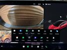
View attachment 748448