Welcome to Tesla Motors Club
Discuss Tesla's Model S, Model 3, Model X, Model Y, Cybertruck, Roadster and More.
Register

Wiki [UK] V11 UI Changes and Features

This site may earn commission on affiliate links.
Driving in the fog last night in my SR+, having the fog lights looked to be a very necessary option as dip doesn't penetrate at all. Do the fog lights help? I may Ebay some and hard wire them in. Pity Tesla don't offer the service or at least have a pay to enable service.
“Pay to enable” only works where you already have the hardware fitted… the SR+ doesn’t have the fog lights.

I’ve had various cars with fitted fog lights and the benefit is questionable. It often depends on the fog… if you are are genuinely down to the point of crawling along at little more than walking pace then the ability to pick out the road edges can make a difference, but giving a longer view ahead not so much. Maybe I’m wrong and the M3 has magical fog lights but I tend to think we’re unlikely to be missing much.
 
  • Like
Reactions: Yachtsman
I had a long trip yesterday and really was getting agitated at some points not being able to intuitively find things. The screen misted up and genuinely panicked not knowing where the de mister was. The blind spot thing is good in principle, but in practice more risky taking your eyes off the road, moving your hand, then last second checking to double check what the camera says. Wipers, still random super fast wipes at times.

I don’t like the new display, don’t think it is as nice as the previous. I miss the trip and the tyre pressures. Also felt the climate menu was annoying, including going into sync randomly. The charging menu not as good - I liked the big charging view now it’s small! Also, the map itself isn’t as good - the charge state end of trip isn’t as easy to see and the charge point finder isn’t like before :( the map seemed slower to me for some reason

Sentry was off yesterday. Left the car in a small car park and wanted the footage to look at - couldn’t find the menu to look at it before leaving the car park! So annoying!

I think it’s a step back… I was just getting used to the last one!

Positives are sonic (controller needed), sentry live (camera quality doesn’t seem great), and…hmmmm…can’t really think of much else :((

Can one do a windows and go back to a previous version
I don’t know if it’s just me but I found the wipers worse; didn’t find them too bad before…the removal of the demisting controls to a lower level in the menu is a mystery🤷🏼‍♂️
 
  • Like
Reactions: SirBaz
I'm not sure how much of the FSD stuff filters down to those of us who have plain ol' basic Autopilot, but that did feel much smoother today.
That's only a general impression so far, but I have a long trip in a few days' time where it may get quite a bit of use...
 
Still not got the update
I’m surprised you want it based on all the feedback in this discussion. 😀

Hopefully the valid gripes are dealt with quickly as the UX seems to have gone backwards in some respects. At the same time, when I got my first model 3 late 2019 there wasn’t even sentry mode and so having access to cameras from my mobile now feels like a bonus on top and I’m seeing positives from this release.

I commissioned an iPad app for the company I worked for when the ipad1 came out and it was a real PITA trying to keep it looking consistent when Apple kept changing their OS designs. Right or wrong, it seems a lot of v11 is trying to do that and I’m grateful that they are providing it to existing customers rather than software updates only going to the next model like the car industry of the past.
 
I am really surprised that they can change size / position of regularly used main controls without some regulatory approval.

And honestly, the established pattern of a few crumbs of improvement mixed with a smattering of bug fixes for the previous round of glitches introduced sugar coated with promises of great things to come does lose its attraction quite quickly, especially when 2 year old cars and newer are labelled as 'legacy' and not in line for even the crumbs or real improvement.
 
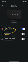
You need to go into Security and turn on Sentry, if it's not already on, and there's then a small and not-very-obvious link that appears underneath.
Sorry but I'm still struggling lol
 

Attachments

  • AA74DA03-EB9F-42E3-B2B7-D21A2BDDF8B8.jpeg
    AA74DA03-EB9F-42E3-B2B7-D21A2BDDF8B8.jpeg
    280.5 KB · Views: 141
I had a long trip yesterday and really was getting agitated at some points not being able to intuitively find things. The screen misted up and genuinely panicked not knowing where the de mister was. The blind spot thing is good in principle, but in practice more risky taking your eyes off the road, moving your hand, then last second checking to double check what the camera says. Wipers, still random super fast wipes at times.

I don’t like the new display, don’t think it is as nice as the previous. I miss the trip and the tyre pressures. Also felt the climate menu was annoying, including going into sync randomly. The charging menu not as good - I liked the big charging view now it’s small! Also, the map itself isn’t as good - the charge state end of trip isn’t as easy to see and the charge point finder isn’t like before :( the map seemed slower to me for some reason

Sentry was off yesterday. Left the car in a small car park and wanted the footage to look at - couldn’t find the menu to look at it before leaving the car park! So annoying!

I think it’s a step back… I was just getting used to the last one!

Positives are sonic (controller needed), sentry live (camera quality doesn’t seem great), and…hmmmm…can’t really think of much else :((

Can one do a windows and go back to a previous version
If you find a way to go back to previous version - do let me know.

I really hate this new UI - why the hell would you take away basic controls you use regularly and hide them in other menus! Also hate the new icons but could live with that if at least the controls were still there!
 
Noticed what looks like a bug in the charging screen. The car reported my last charging session, which was 2 days ago at a public 50kW charger, as a SuC session. The price listed against that charge was what I incurred the last time I used a SuC - in August.

Move fast and break stuff, indeed.
 
Things I like about the new update.

- MPH display is clearer
- Live sentry mode
- Blind spot camera
- New Sonic Game

Things I dislike.
- two clicks for seat heaters
-loss of trip cards and now two clicks for trip info ie: miles per kWh
- two clicks for tire pressure
- changed audio user interface

I would really appreciate the return of trip cards

Overall, okay it feels like a net gain, but lots of unnecessary changes.
 
  • Like
Reactions: Mrklaw and Doudeau
Working in Software Development, I’ve seen this happen dozens of times.

Company starts with a product designed and created by developers. It’s highly functional.

As the company grows, they decide they want to copy Apple and be all “user focused”, so hire a User Experience team. Said UX team suggests loads of changes, a lot of them detrimental to functionality, but supposedly in alignment with touch screen conventions.

And we arrive at something like V11.
I am not sure about Tesla copying apple. Apple is very conservative in its UI development and execution. Apple’s business is about making money first so apple will do same iterations again and again if people buy it.

Tesla’s philosophy is disruptive business model in a conservative sector and shifting the focus in an established automobile sector. Steve jobs or Apple never had that as their primary objective in software or hardware business.

We may not see this new v11 as a modern UI. But there is no doubt the earlier version was bit jaded and looking like a big Kindle. I like the earlier version it is classy and kind of had a retro charm. But I don’t think the new car buyers in US which Tesla mainly cater to see it that way. They are comparing the Stang Mach e and Audi e tron and the new EQS with Model 3/Y. I don’t think Tesla wants to lose this customer base. Already there are lots of negative reviews about Tesla in terms of quality of build etc., compared to Germans and if Tesla doesn’t up the game in the UI software side they are going to lose more new customers.

The change is mainly to attract the new customer base and broaden the US customer base. Don’t know whether you’ve noticed when you drive the car at night time now you predominately see a blue/white/red hue in patches especially if it is in auto and if you open the split heater button- it is very subtle but I can see where Tesla is going with these colours.
 
Last edited:
The UI team probably hate it too, most of them. They just don't have much choice.

I'm that 'resist pointless bullshit' person in our little company and luckily I've got just enough clout to head off most of the wildest ideas. I can't imagine doing it in a company with a CEO like Elon.. he'd say 'I want it this way' and your hands would be tied.
 
I compared the blind spot view to my mirror and found it doesn’t show any more than the mirror does. At least the position I have my mirrors in.

Plus I‘ve been a motorcyclist for 30 years and shoulder checks are ingrainEd in me, so it’s staying off in my car.
I'm a motorcyclist too and know all about 'lifesavers'. Still see it as a valuable addition but each to his own.